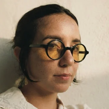
Karen Ramos in warm late-afternoon light, wearing round glasses with yellow lenses
UX Lead · Senior Product Designer

I design complex, regulated products, and the teams that build them.

Most recently, I led UX at a cyber insurance startup, and before that designed for Oracle Advertising and Barstool Sportsbook & Casino. Today I design for clients of Definition, a healthcare communications and consulting firm, and Sparkbox, which builds design systems for large organizations.

11+ yrsdesigning digital products, from agency to in-house
2 → 8people on the UX team I grew at Penn Interactive, across design, research, and content
8industries, from sports betting and ad tech to banking and healthcare
#1among sports and betting apps in the App Store on launch weekend, for the Barstool Sportsbook app I helped design
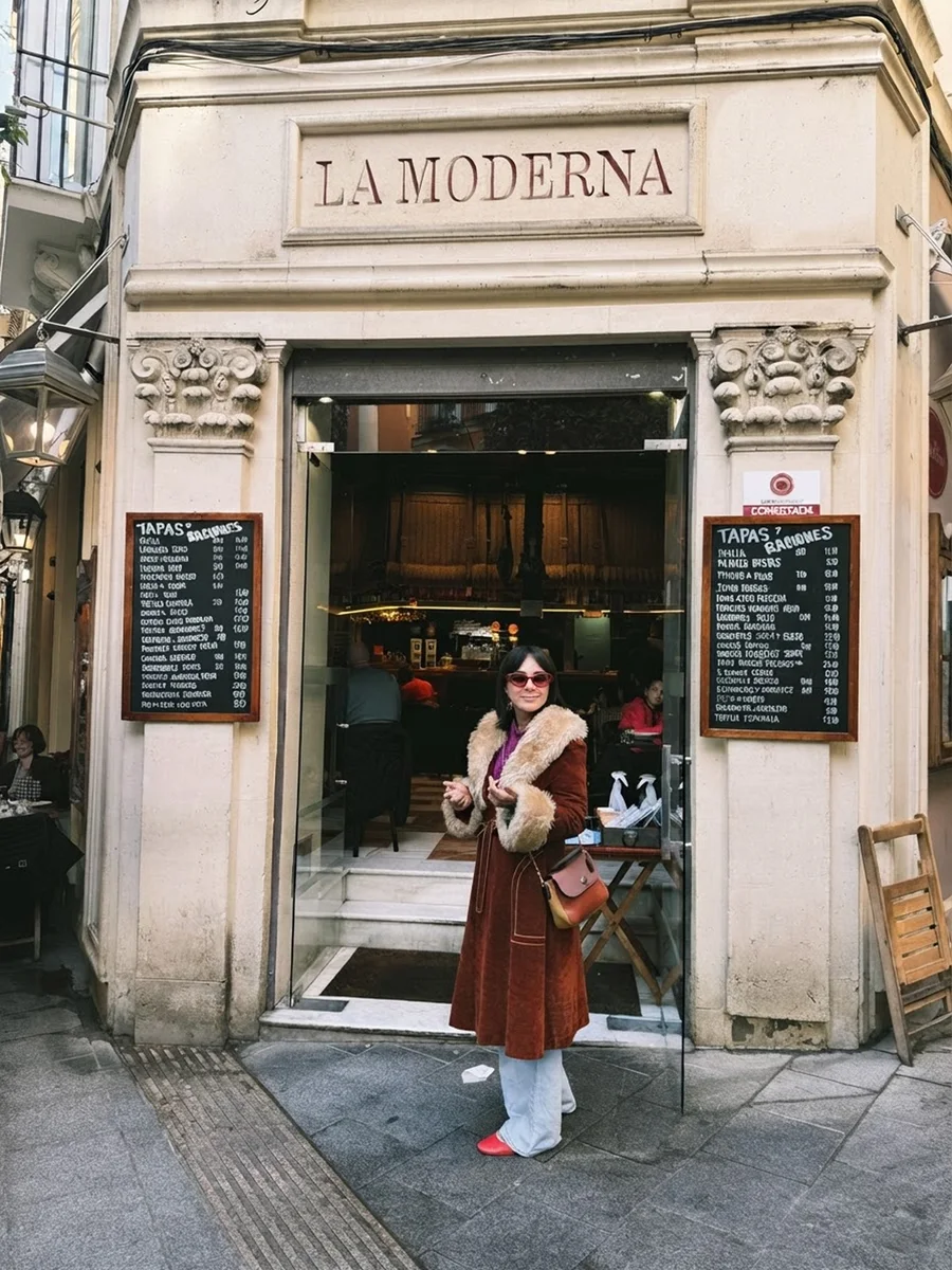
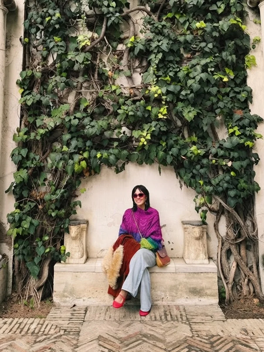
Karen in a rust corduroy coat outside La Moderna, a tapas bar in EuropeKaren sitting on a stone bench under an ivy-covered wall between two marble columns

About

From agency art direction to leading UX teams

Location

St. Petersburg, FLHybrid or remote

Languages

EnglishEspañol

Education

BFA, Design & Digital Arts · Escuela de Artes Plásticas y Diseño de Puerto Rico

Certification

NN/g UX Certified, UX Management specialty · 2021 · Verify, ID 1046106 ↗

I've spent more than a decade in design, most of it on products with heavy data and strict rules: sportsbooks, ad tech, insurance, and healthcare.

I started in advertising in Puerto Rico as a graphic designer and art director, and the digital projects pulled me toward UX. I moved to Philadelphia and in-house: UI design at SapientRazorfish, UX at Morgan Lewis, then UX Lead at Penn Interactive, where I grew the team from two to eight and served on the Diversity Committee. From there, I designed enterprise ad tech at Oracle and led UX at Elpha Secure. Today, I design for clients of Definition and Sparkbox.

My dad and granddad both come from law, so reading the fine print started early, and regulated products still feel like a puzzle to me. Off the clock, it's music, art, and building things with AI, like this site.

2026–nowSenior Product DesignerKaren Ramos Digital
2023–2026UX Manager · Senior Product DesignerElpha Secure
2021–2023Principal Product DesignerOracle
2019–2021UX Lead · UX/UI DesignerPenn Interactive
2018–2019UX DesignerMorgan Lewis
2017–2018Senior UI DesignerSapientRazorfish
2014–2017Art Director · Visual & Graphic DesignerY&R · KIS Digital
Industries

Sports bettingAd techInsurtechBankingHealthcarePharmaLegalTelecom

Craft

Information architectureFlows & systemsResearch & testingPrototypingDesign systemsAccessibilityWorkshop facilitationTeam process & DesignOpsUI & visual designBrand & art direction

How I work

The habits behind these projects

01

Learn the domain first

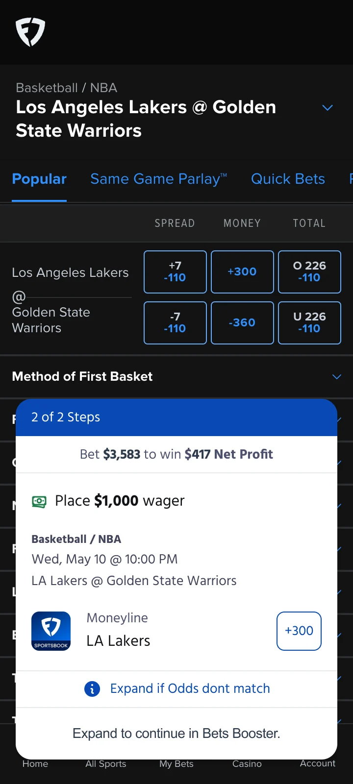
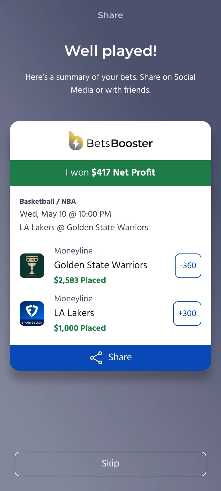
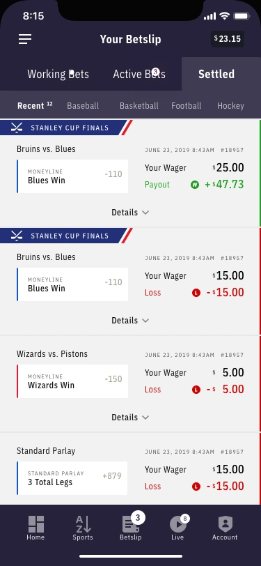
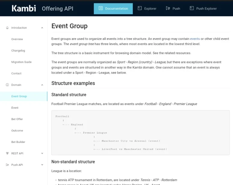
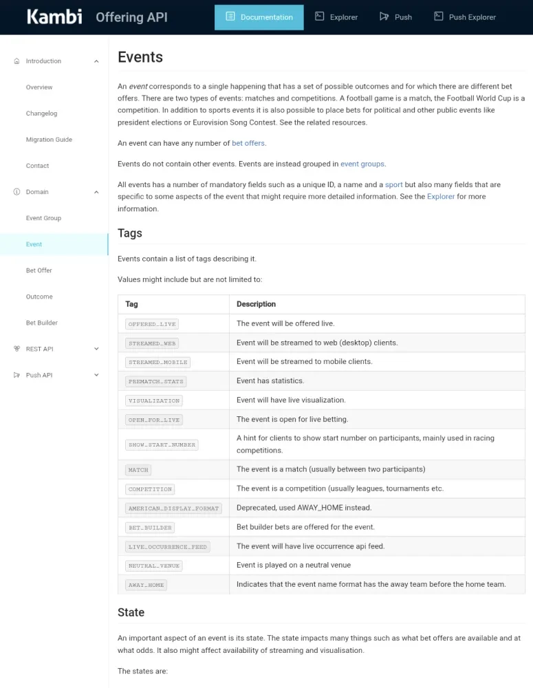
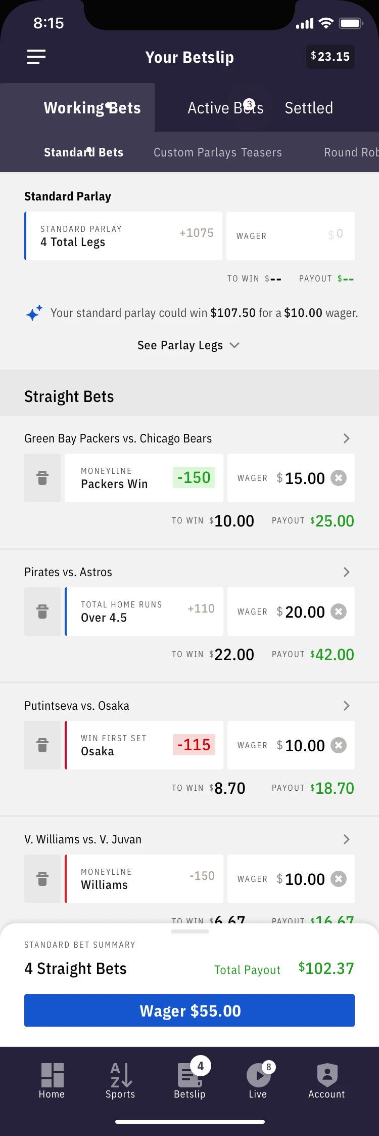
At Barstool Sportsbook, I read Kambi's API docs before redesigning the bet slip, and a survey of 99 bettors showed only 8% placed multiple bets at once, which started a rework of the slip.

Seen in Barstool Sportsbook · Oracle · Bets Booster

02

Map the system before the screens

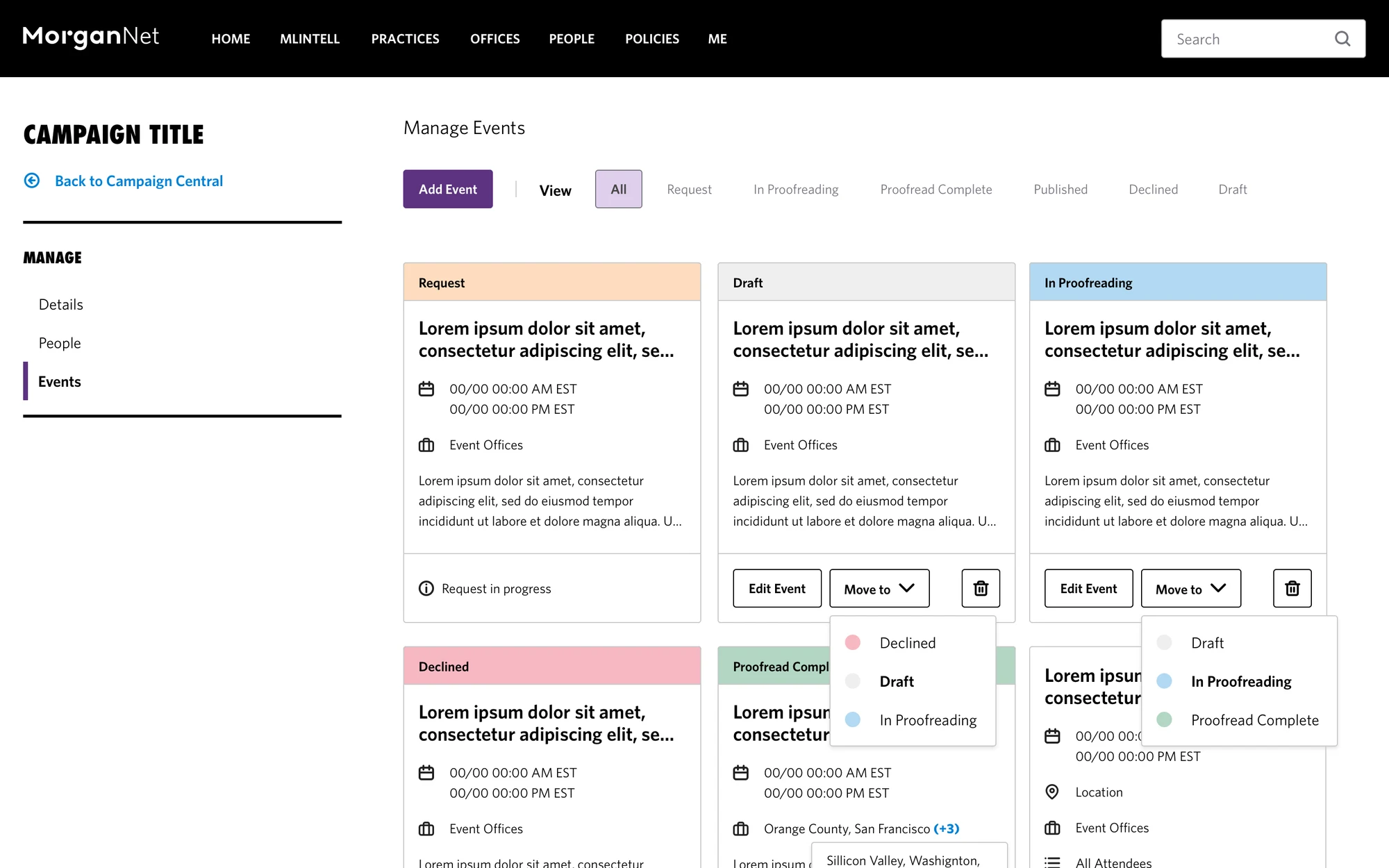
At MMM, I audited 70+ pages and rebuilt the sitemap before designing a template. At Morgan Lewis, the sitemap and status workflow came before the CMS screens.

Seen in MMM · Morgan Lewis · Oracle

03

Design with the constraints

Medicare marketing rules and Section 508 at MMM, SharePoint at Morgan Lewis, and a design system still rolling out at Comcast were part of the brief from day one.

Seen in MMM · Morgan Lewis · Comcast

04

Test with real content

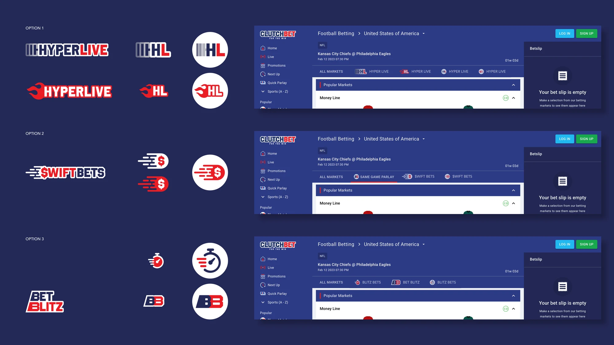
The real sportsbook feed broke the agency's tidy headers, so I redesigned them around it. At Clutch, I placed every name option in the live markets tab before recommending one.

Seen in Barstool Sportsbook · Clutch

05

Bring the team along

At Oracle, I led workshops that aligned Product and Engineering on one suite. At Penn Interactive, anyone could submit a research question, and results were shared in open readouts.

Seen in Oracle · Barstool Sportsbook

06

Leave structure behind

A design system and a research process at Penn Interactive, a style guide with code at MMM, and a CMS Morgan Lewis managers could run without a developer.

Seen in Barstool Sportsbook · MMM · Morgan Lewis

Growing a UX practice while the product launched

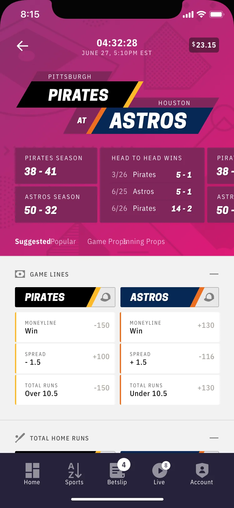
I joined a two-person design team as a UX/UI designer and became UX Lead of an eight-person practice, while the app launched and grew across web, iOS, and Android.
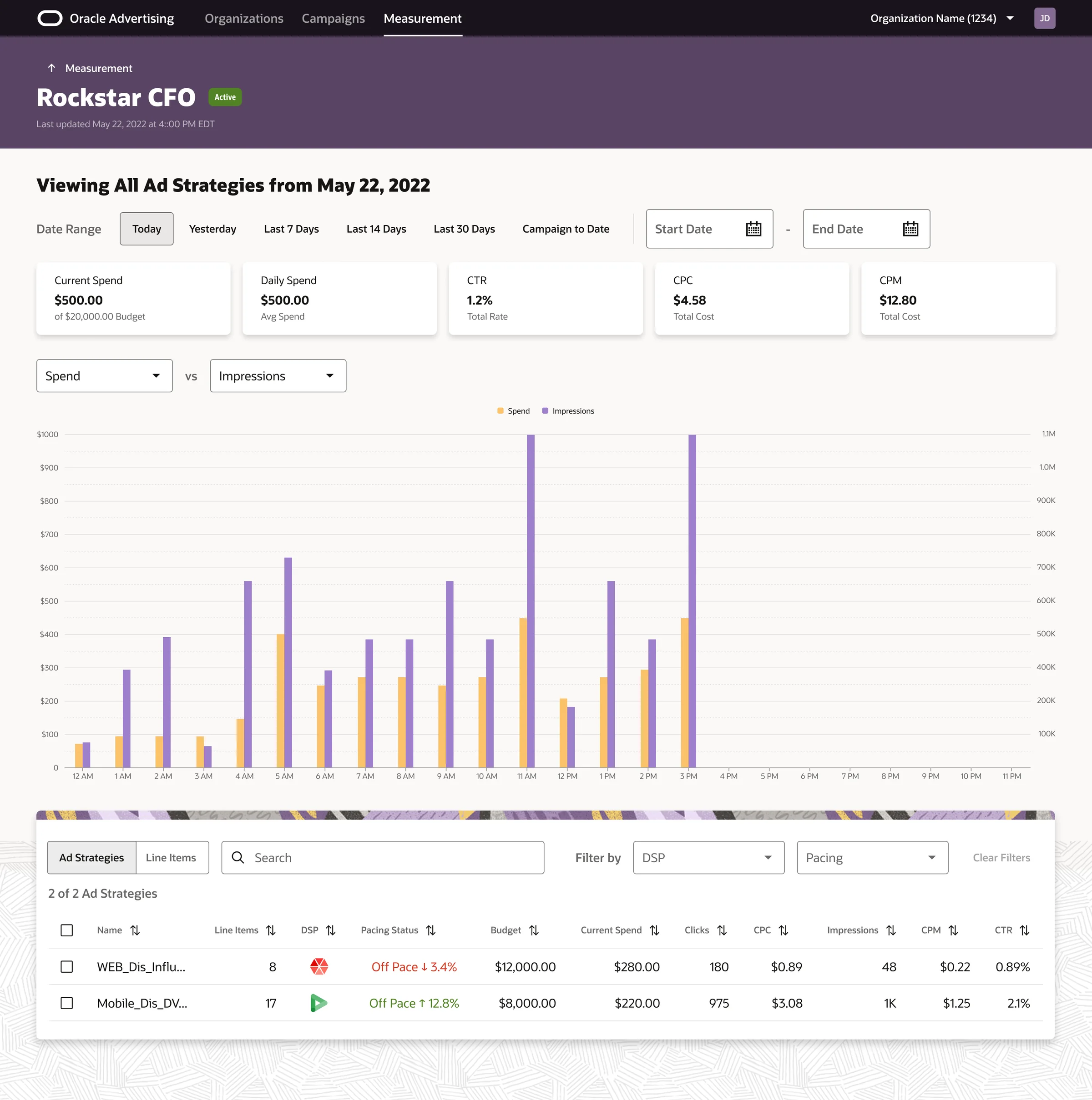
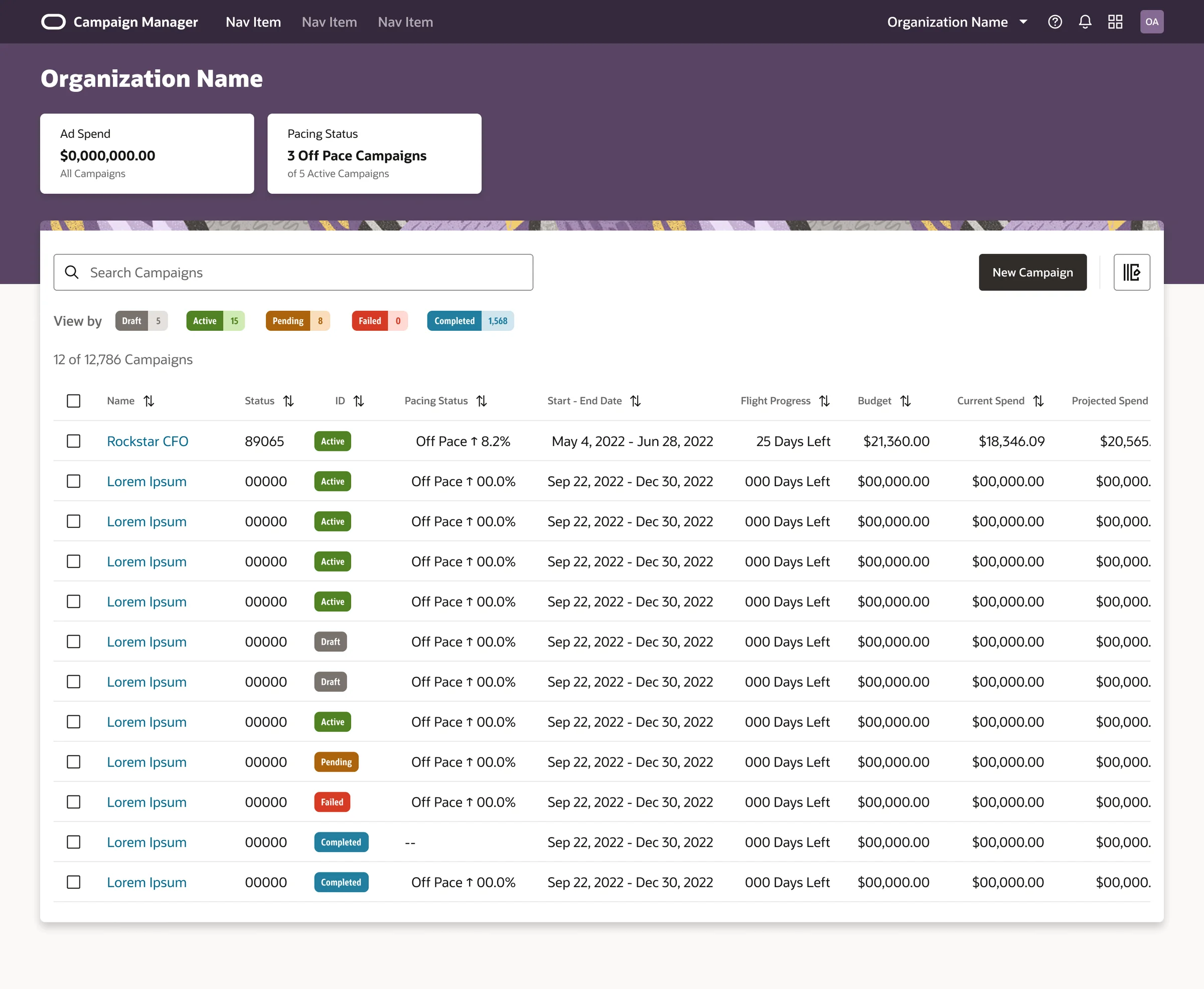
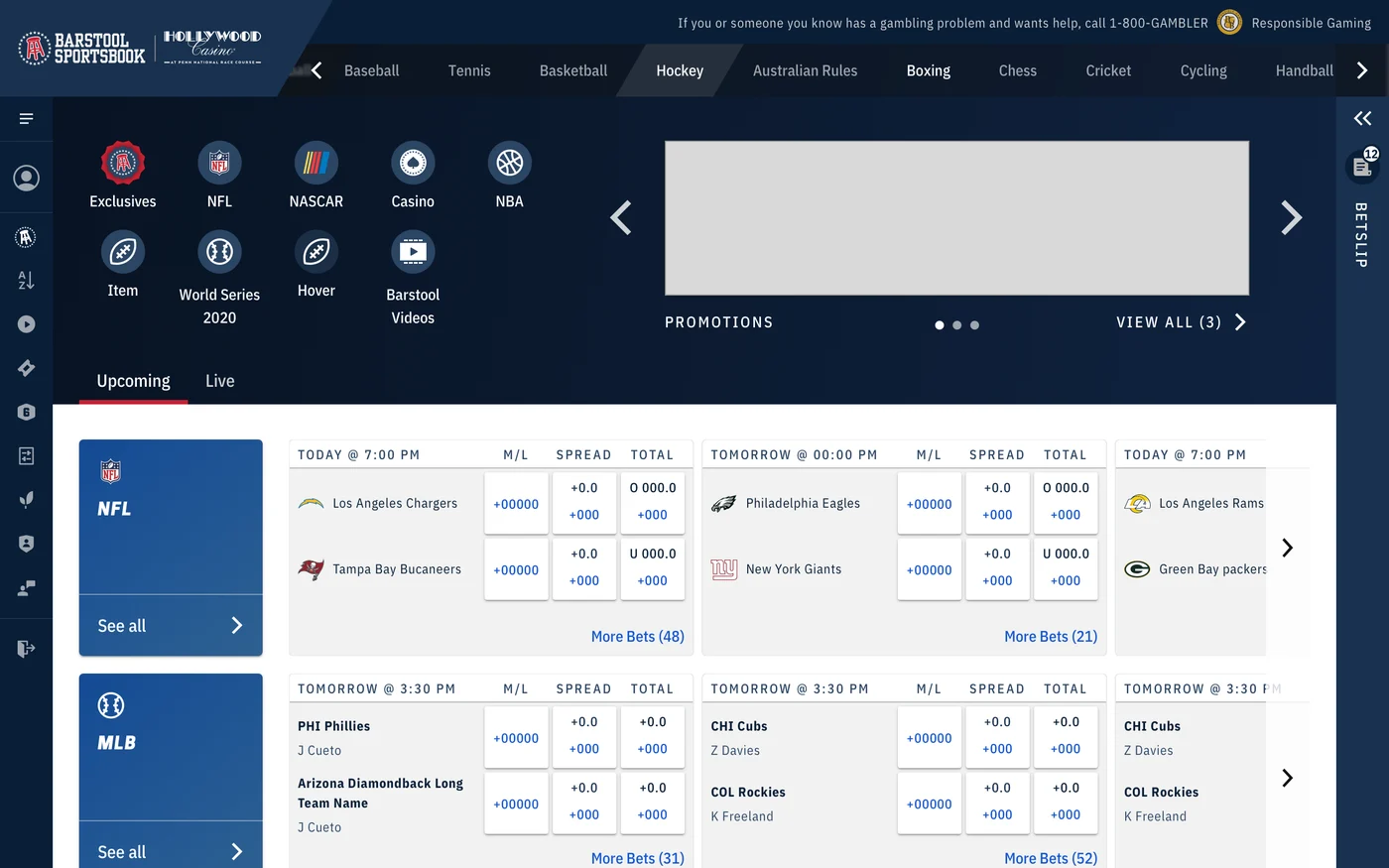
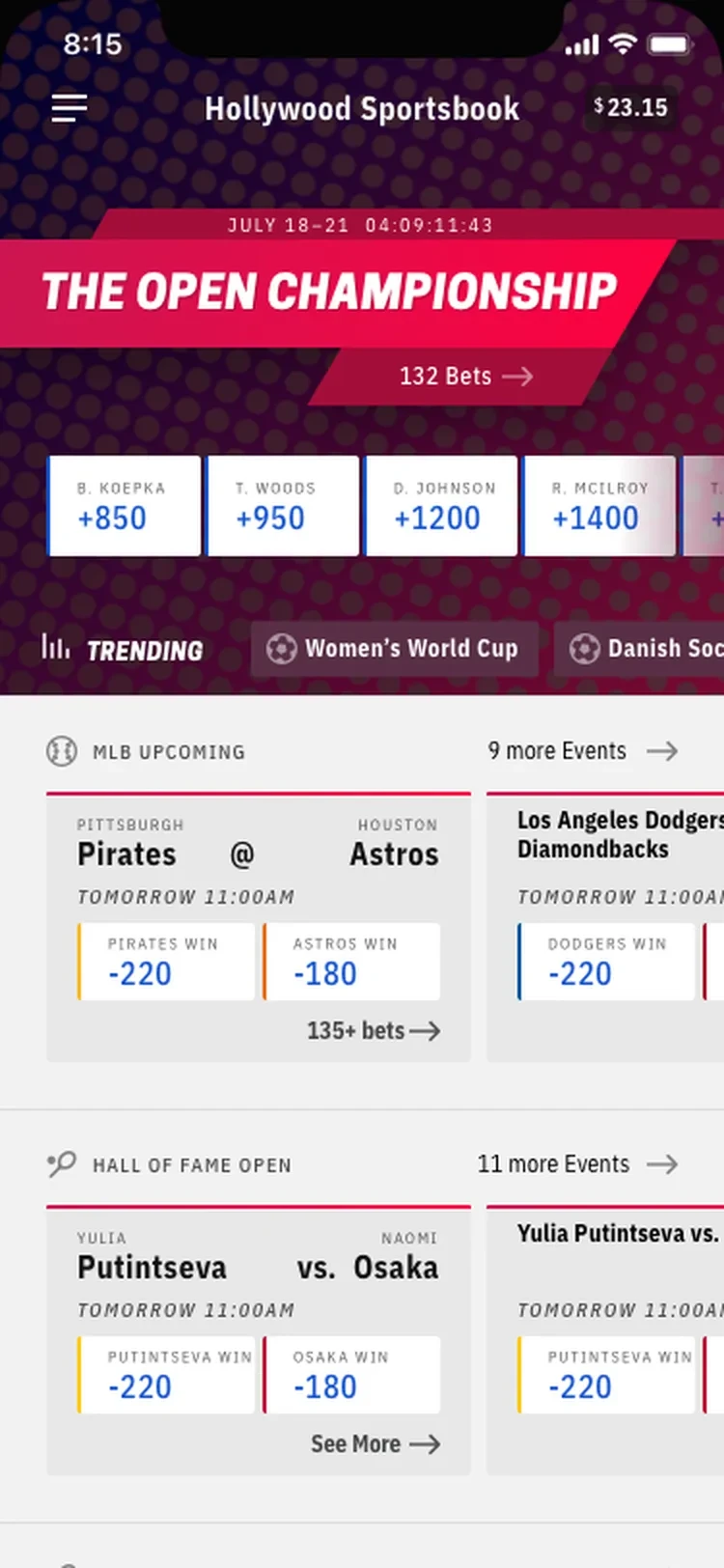
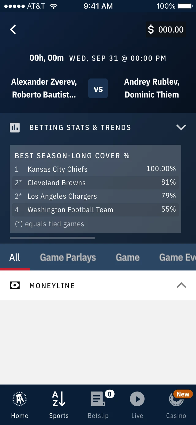
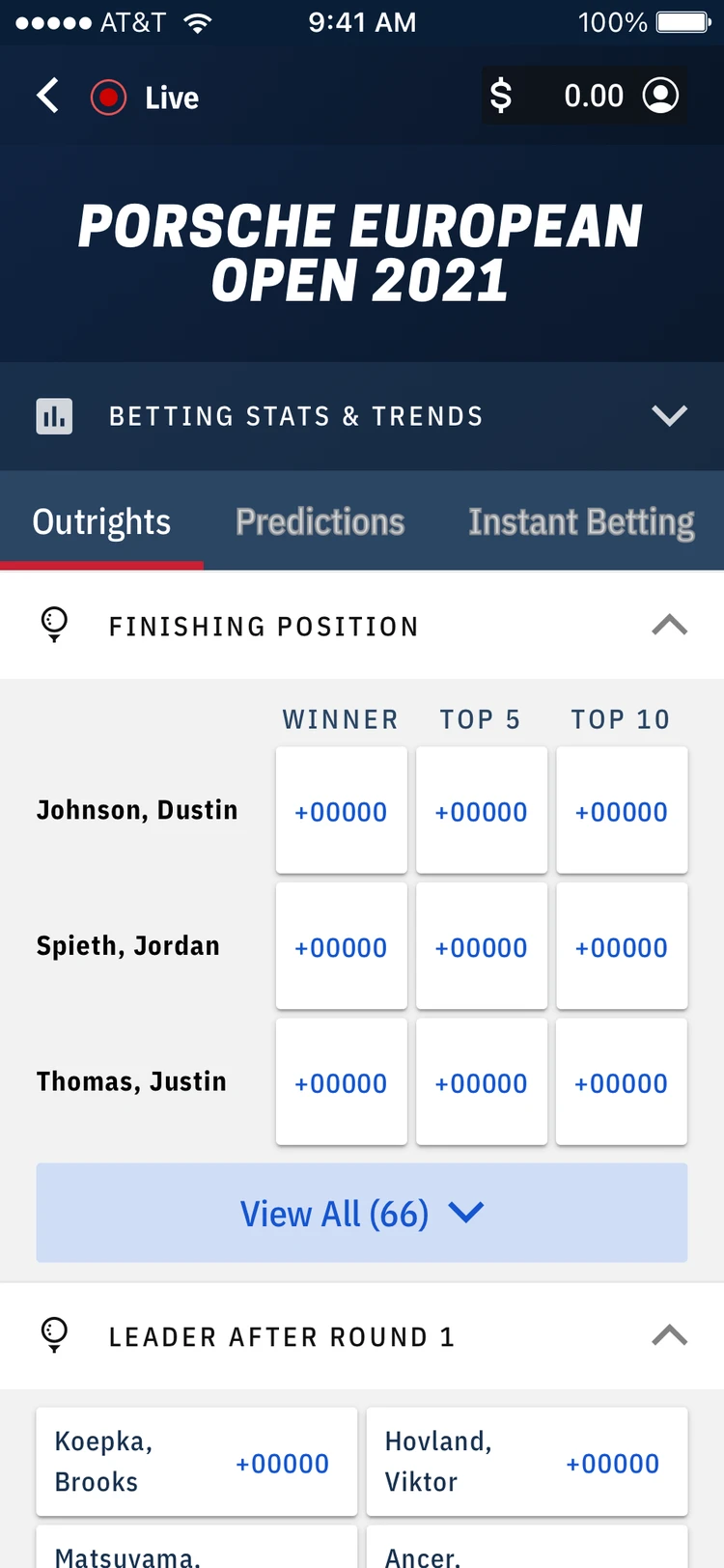
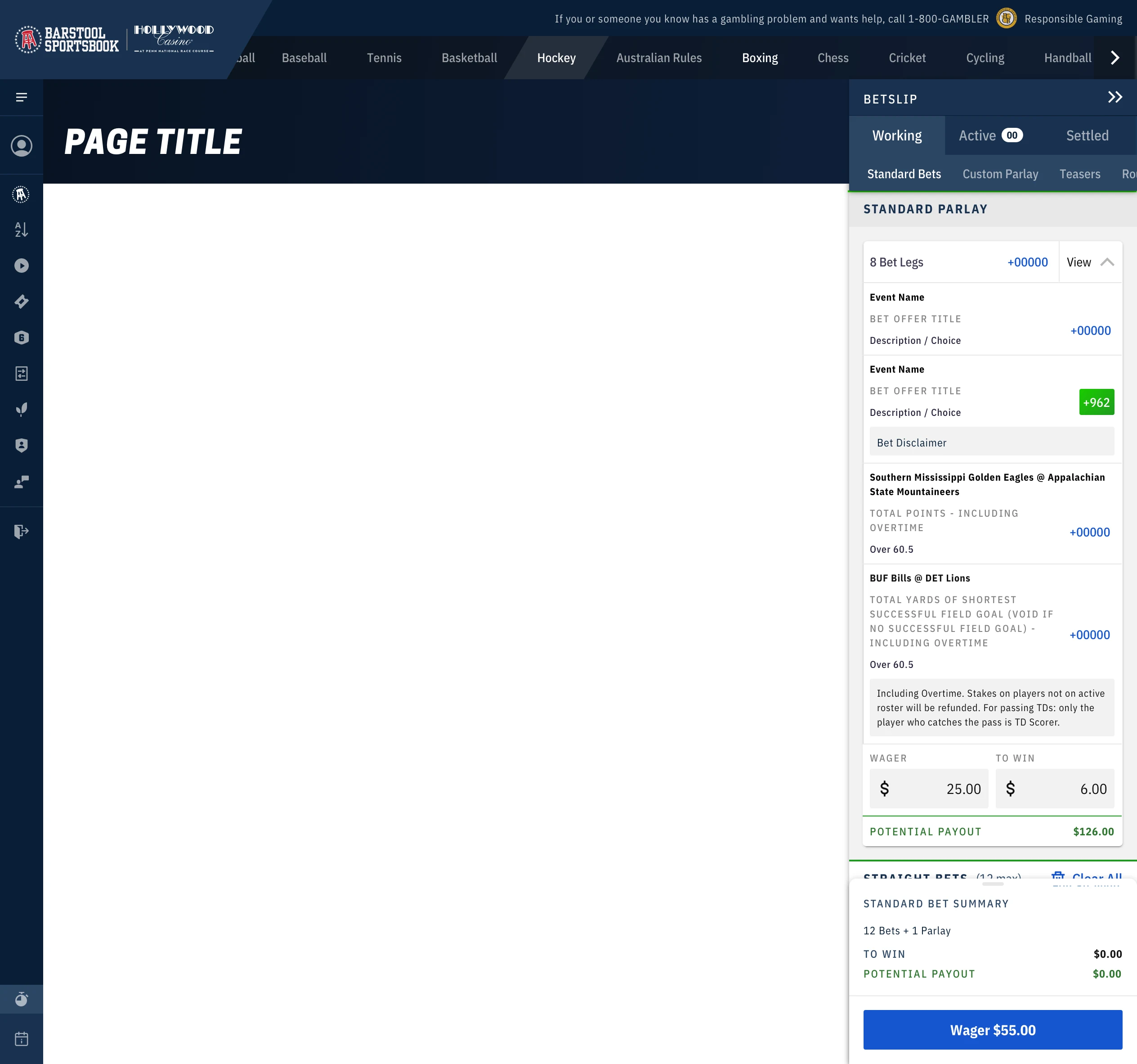
Shipped Barstool Sportsbook home page on web
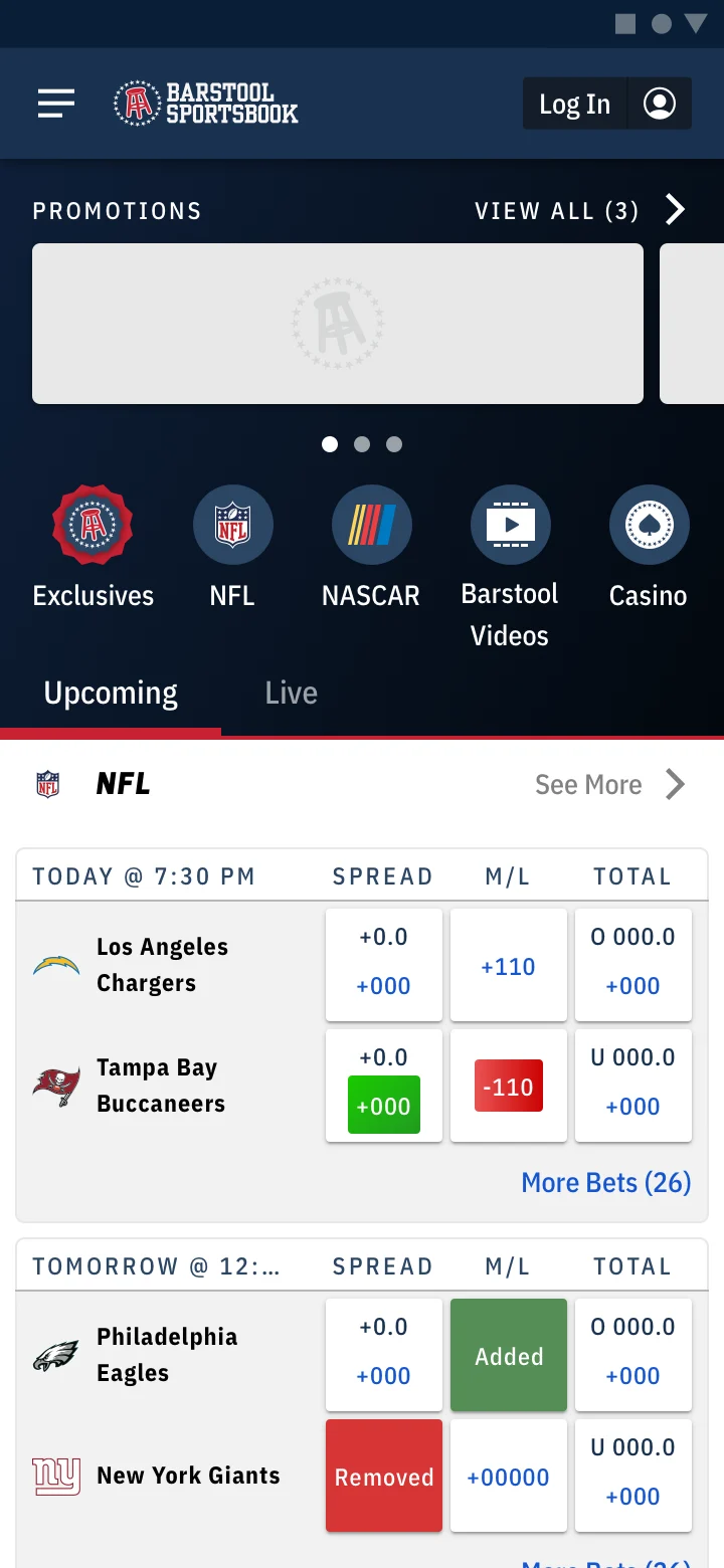
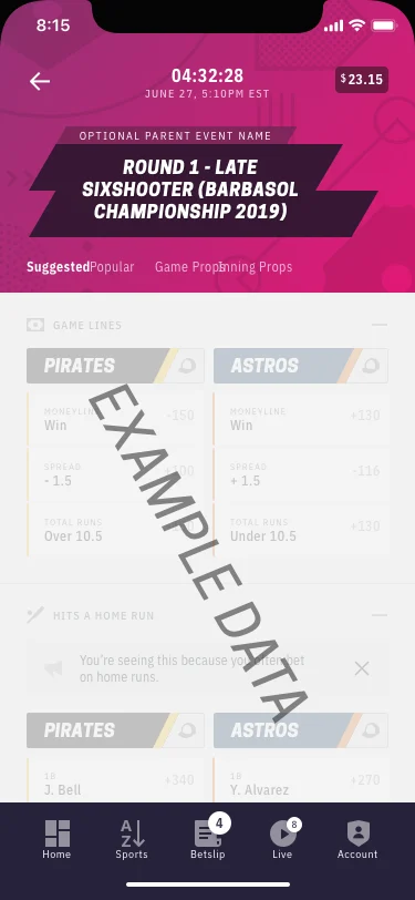
Shipped Barstool Sportsbook home page on Android
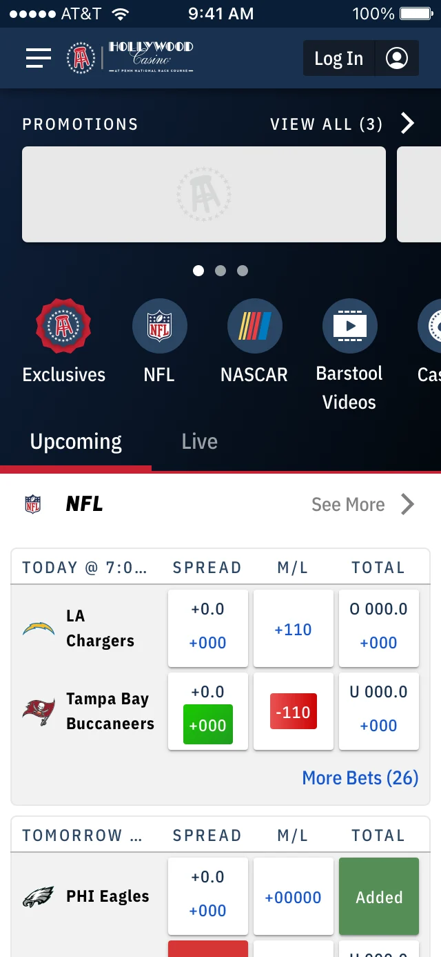
Shipped Barstool Sportsbook home page on iOS
Company
Penn Interactive
Role
UX/UI Designer → UX Lead
Timeline
2019–2021
Team
2 → 8 across design, research, and content

Barstool Sportsbook & Casino was Penn National Gaming's online sportsbook, built and run by its digital arm, Penn Interactive, and branded through its partnership with Barstool Sports. It was a young product in a competitive, regulated market, where speed to market usually came first. Its bettors ranged from sportsbook regulars to casino players trying sports for the first time. I joined to improve key flows, starting with the bet slip.

As it grew across web, iOS, and Android, so did my role: I became UX Lead, brought in research, and built the team and process around it.

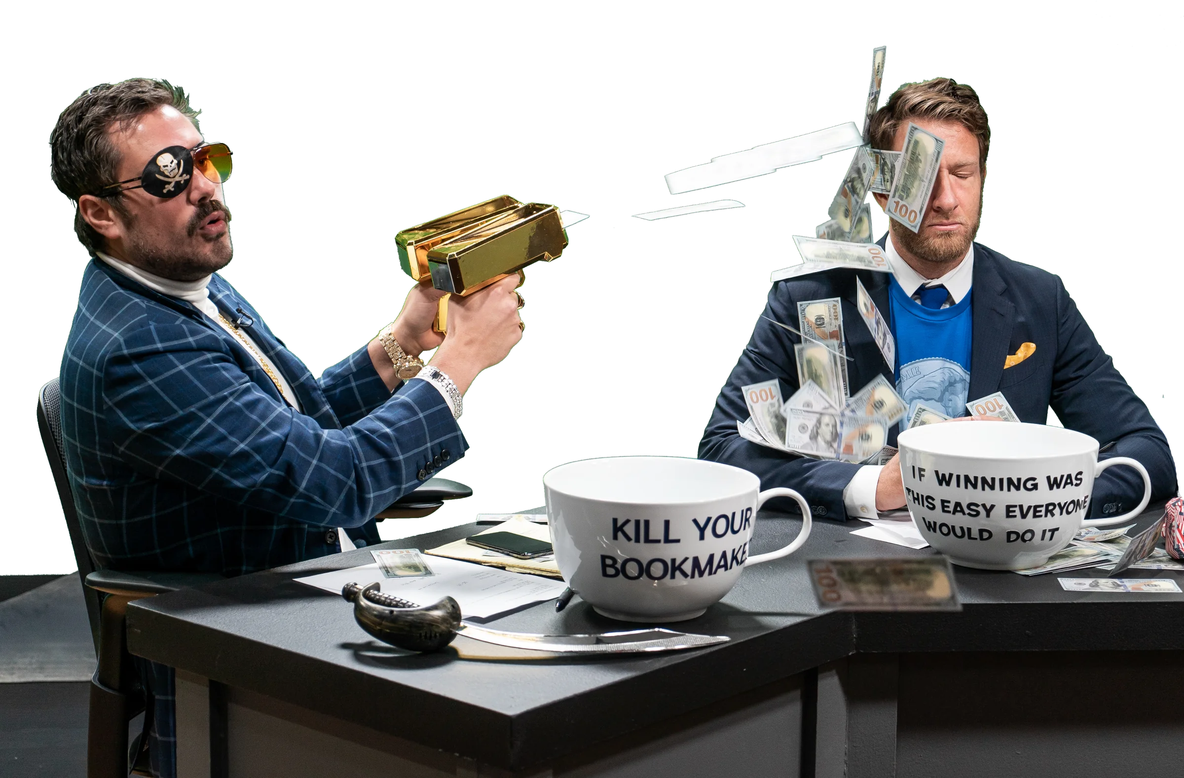
Barstool Sports personalities: the loud brand the app had to carry

From feature work to running the practice

My scope grew with the product: first the features with the most impact, then decisions across platforms, then how UX worked as a team.

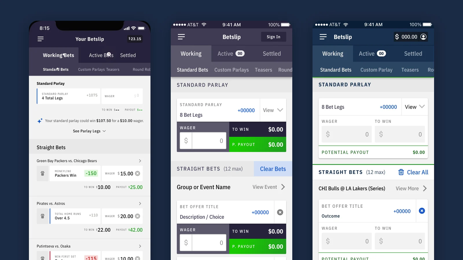
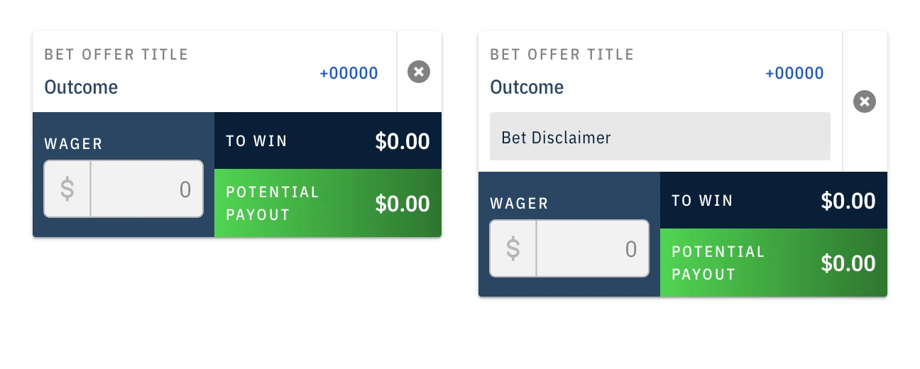
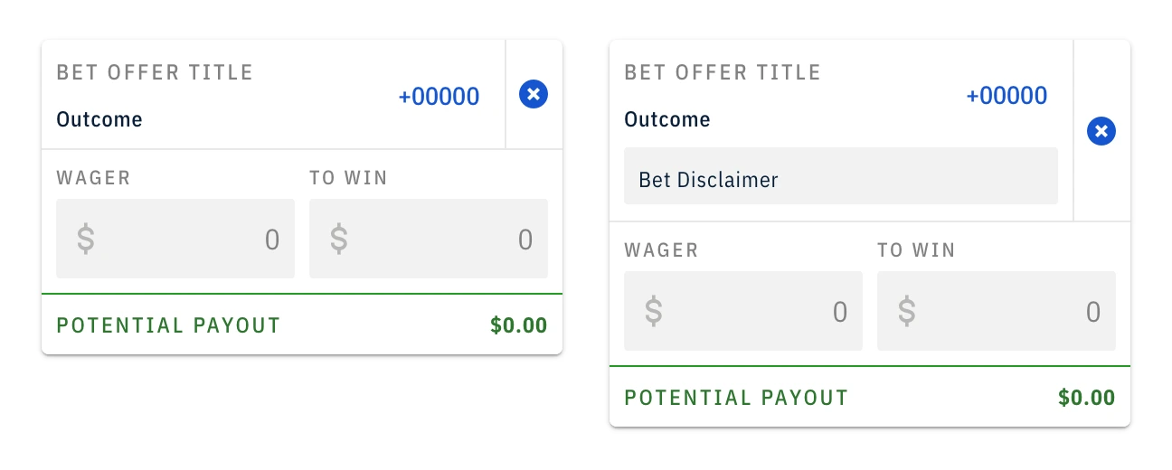
Bet slip iterations: the agency design, the first in-house version, and the improved slip
FoundationExecution & early impact

Redesigned core betting flows, starting with the bet slip, to cut friction and set early UX and brand consistency.

→
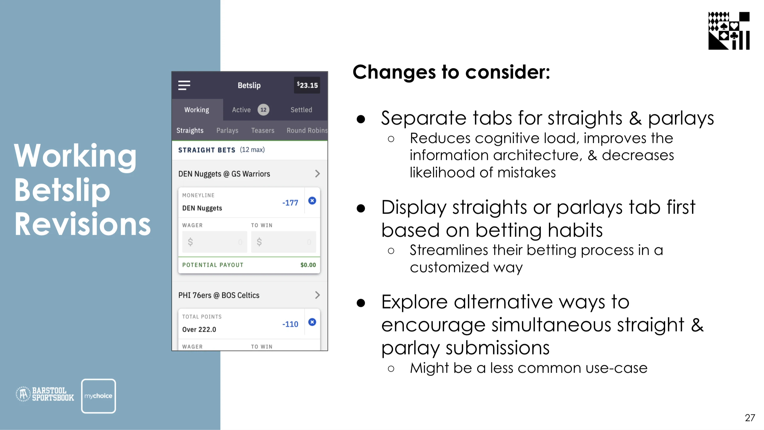
Working bet slip revisions research slide
ScaleSystem thinking & product maturity

Carried the design across web, iOS, Android, and the casino, and brought in research to learn how people actually bet.

→
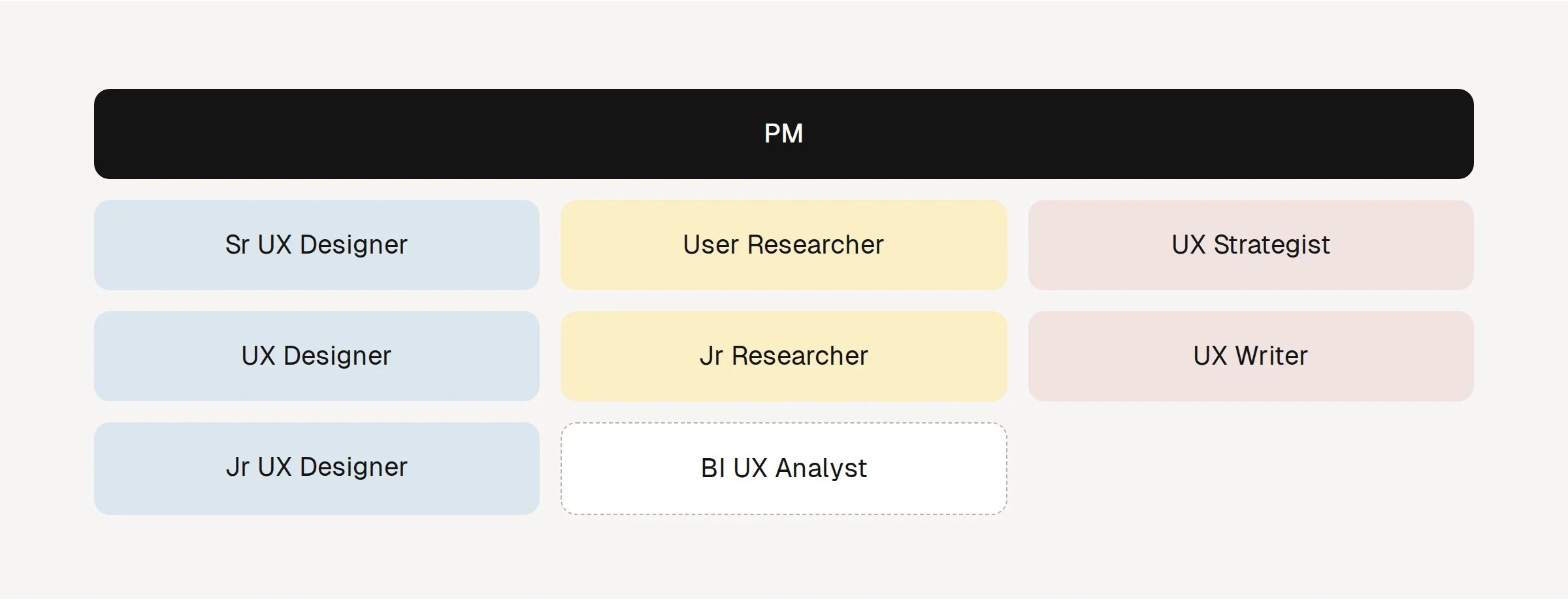
Pod team: PM with designers, researchers, a strategist, a writer, and a BI analyst
ImpactLeadership & UX as a function

Grew an 8-person team across design, research, and content, with the process a fast-growing product needs.

0103Foundation
Shipped

One product, three platforms

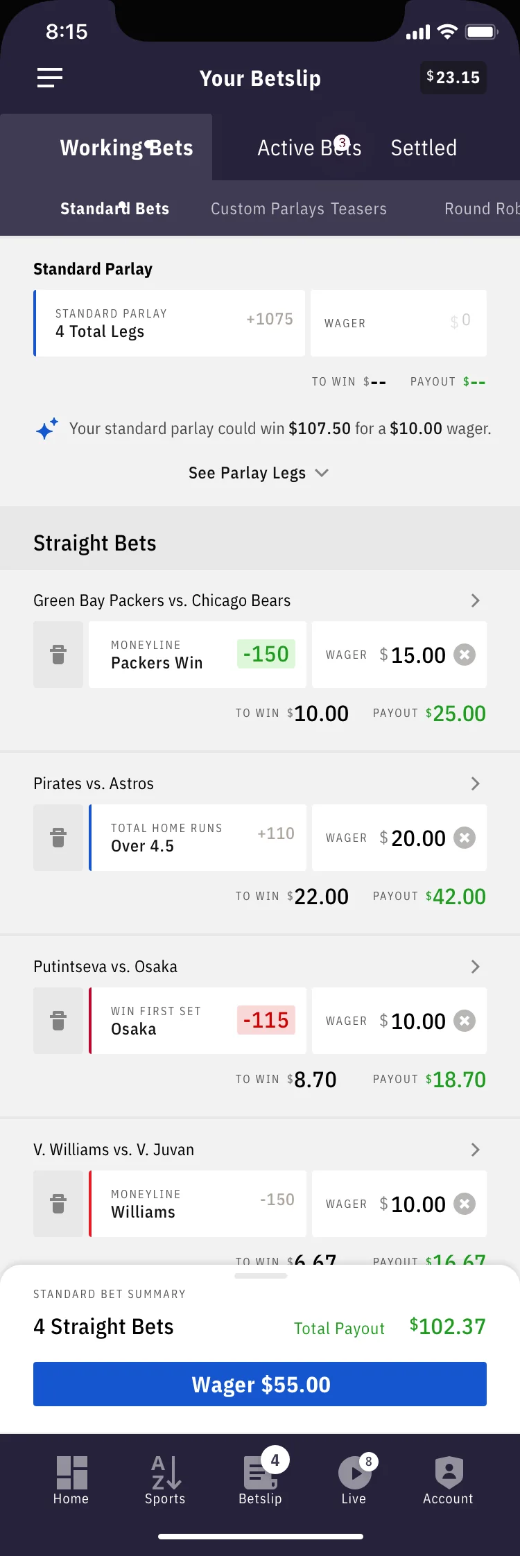
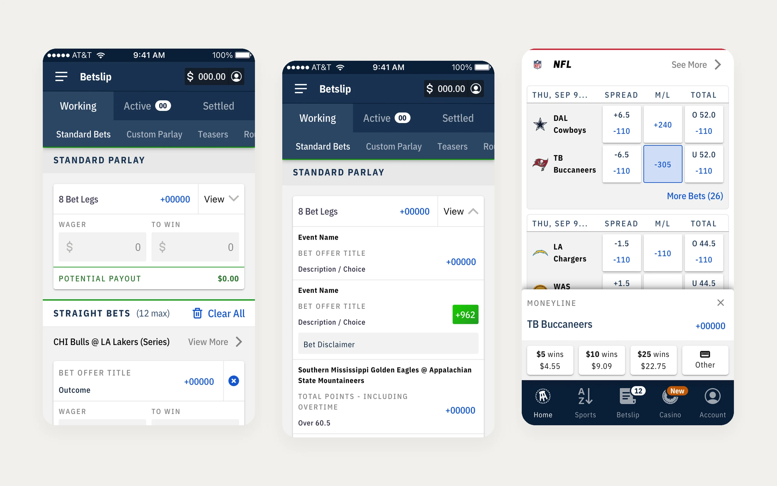
The final slip held up to real bets: long market names, rules notes, odds changes flagged in red and green, a 12-bet limit, and one amount you could apply to every straight bet.

I carried one design language across iOS, Android, and web, with shared grids and specs for each platform, so a bettor could switch devices without relearning the app. The app launched in Pennsylvania in September 2020.

On launch weekend, it was downloaded 63,000 times and ranked #1 among sports betting and sports apps in the App Store for much of the weekend, according to Sensor Tower data and a Bank of America analyst note. A month in, it held a 4.8 average rating in the App Store, according to Penn National Gaming's third-quarter results.

Sources: SBC Americas, Sept. 2020 ↗ · Penn National Gaming Q3 2020 ↗

Web: bet slip panel open with an expanded parlay
Web
iOS bet slip with straight bets
iOS
Android bet slip with straight bets
Android
0203Scale
Why research

Decisions were running on assumptions

As the product matured, many decisions still came from stakeholder assumptions, industry habits, and competitor analysis. They helped us move fast, but didn't always match how people actually bet. I partnered with our first dedicated researcher to set up a real practice.

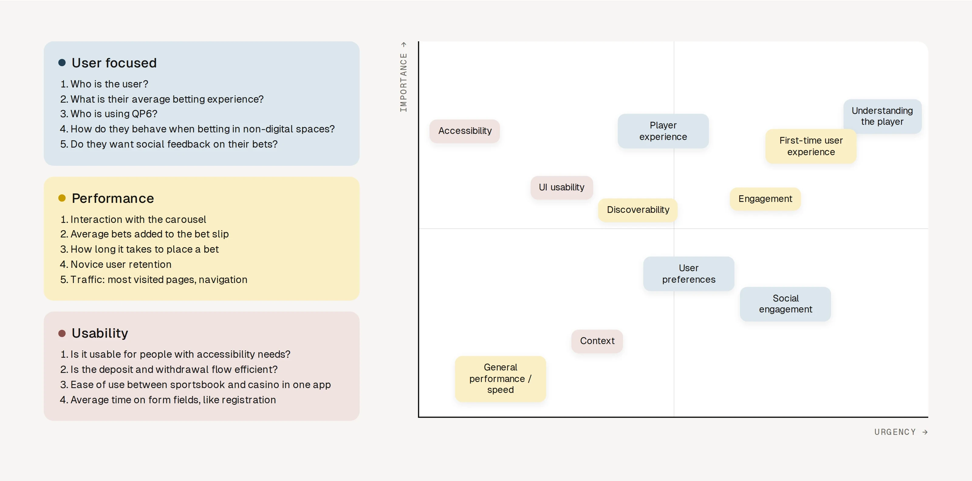
Anyone in Product, Engineering, or leadership could submit a question to test. We ranked questions by importance and urgency, ran two-week research sprints, and shared results in open readouts every other week.

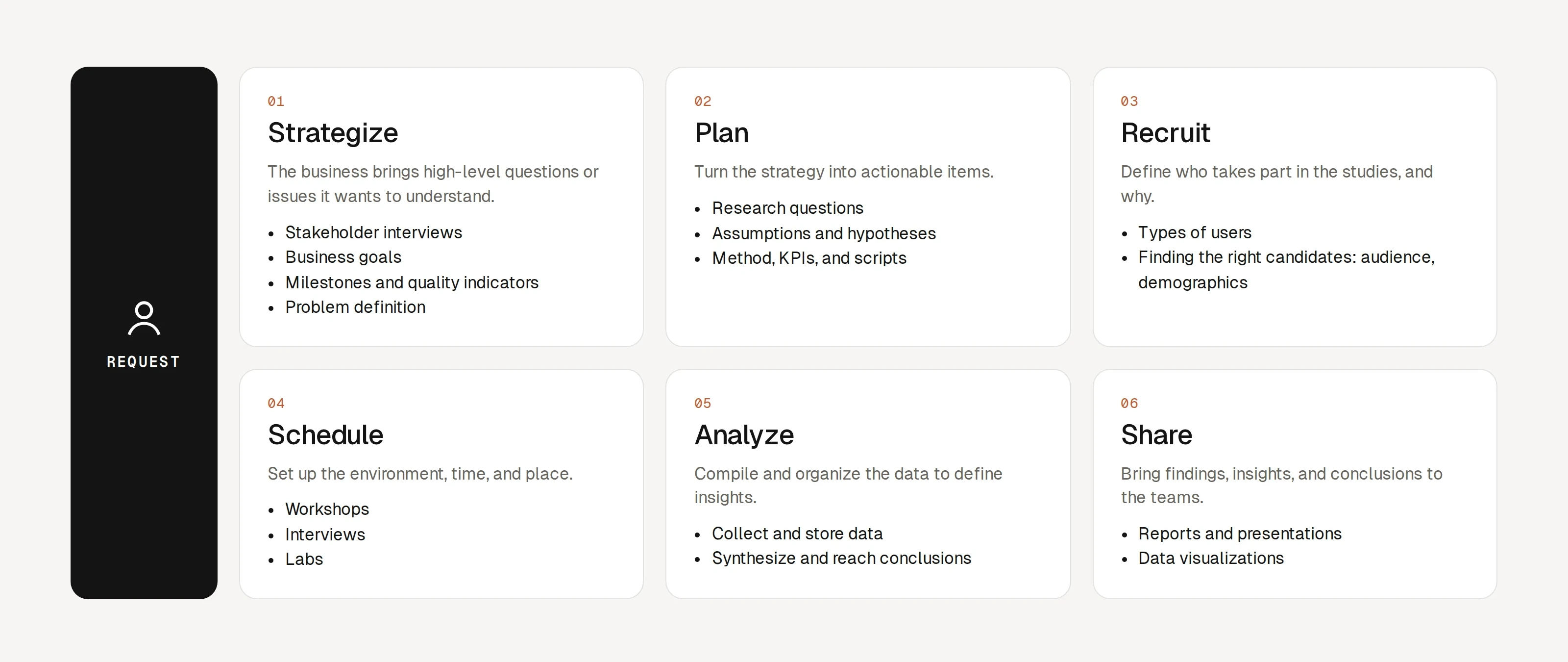
Research process: request, strategize, plan, recruit, schedule, analyze, share
Research process · from a request to a share-out
User testing priorities by category, plotted by importance and urgency
User testing priority · what to test first, by importance and urgency
Turning insights into decisions

Betting is a focused task

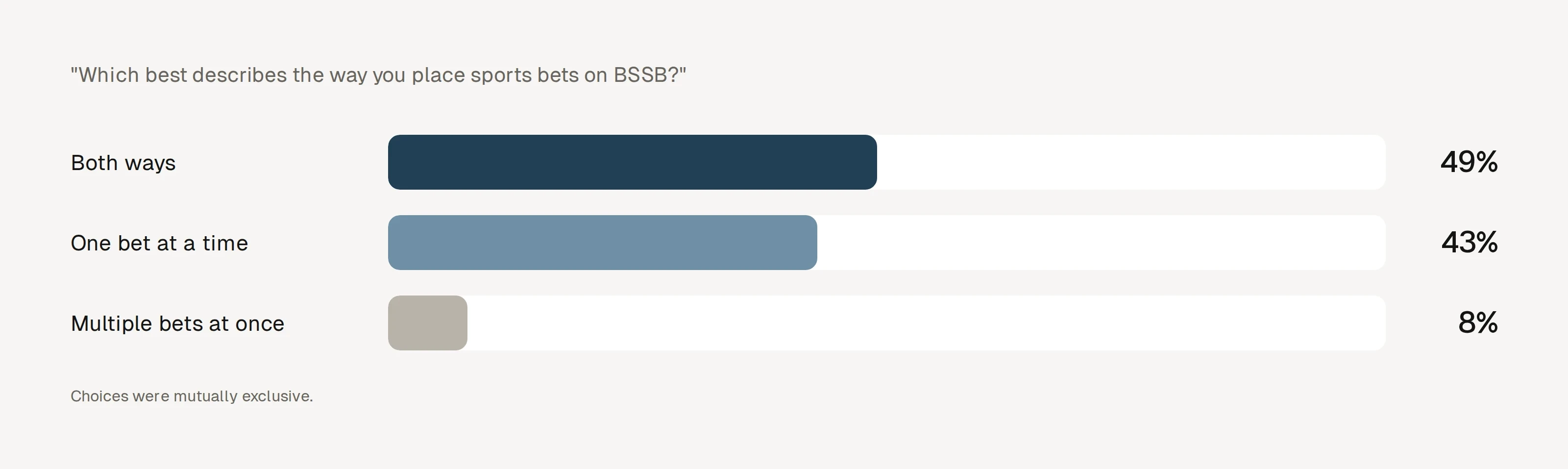
We had assumed people shopped for bets like a cart. In a survey of 99 bettors, only 8% placed multiple bets at once: 43% placed one at a time, and 49% did both. For most people, betting was closer to a focused task than a shopping trip.

Trade-off

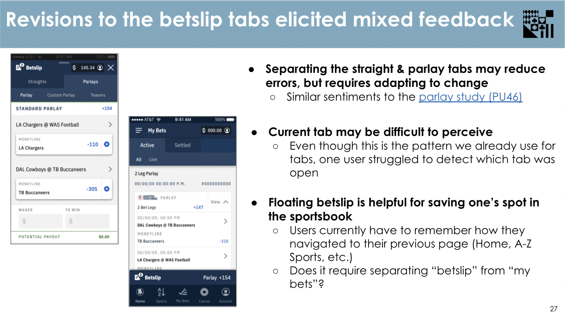
Chose: test separate tabs for straight bets and parlays. Gave up: the all-in-one slip we had shipped. Why: it matched how most people bet and could reduce mistakes. Testing was mixed: separate tabs may cut errors but take getting used to, and one user missed which tab was open. A floating slip that kept their place in the sportsbook tested well.

The results started a rework of the slip: separating straight bets from parlays, and making it faster to bet. Quick wager shipped, letting bettors pick a preset amount in one tap. We explored quick parlays next, and introduced Quick Pick Six, which picked six bets at random from the filters you chose.

Wagering style survey, n = 99: both ways 49%, one bet at a time 43%, multiple bets at once 8%
Wagering style survey · n = 99
Working bet slip revisions: changes to consider
Revisions to the bet slip tabs elicited mixed feedback
Shipped quick wager tray: $5, $10, $25, or another amount in one tap
Quick wager · shipped
Beyond the sportsbook

More of the product, and more of the data

The work grew past the sportsbook. The casino got its own tab in the app, and we designed the experience behind it, from the lobby to the pages where the games lived. We were also bringing Penn's mychoice rewards program in: a card in your profile showed your progress, and tapping in revealed more detail as you needed it.

Behind the scenes, I partnered with the BI team on analytics dashboards. It was a joint UX and BI initiative to see quantitative and qualitative data side by side, so decisions could draw on both what people did and why.

0303Impact
How we worked

A shared way of working

As research spread across teams, UX needed stronger foundations. I defined a shared philosophy and design principles, drawing on design thinking, lean UX, and design sprints, built around what's desirable, viable, and feasible.

Design presentation ↗
Trade-off

Chose: t-shirt sizes in sprint planning, no task over 16 hours. Gave up: precise hour estimates. Why: sizing by risk and complexity was faster and flagged work that needed breaking down.

  1. 01Discovery

    Workshops with Product and Engineering

  2. 02Flows

    User flows and low-fi Axure prototypes

  3. 03Visual

    Sketch, Lottie, shared grids

  4. 04Delivery

    Specs and assets in Zeplin

  5. 05UX regression

    Design review of every release

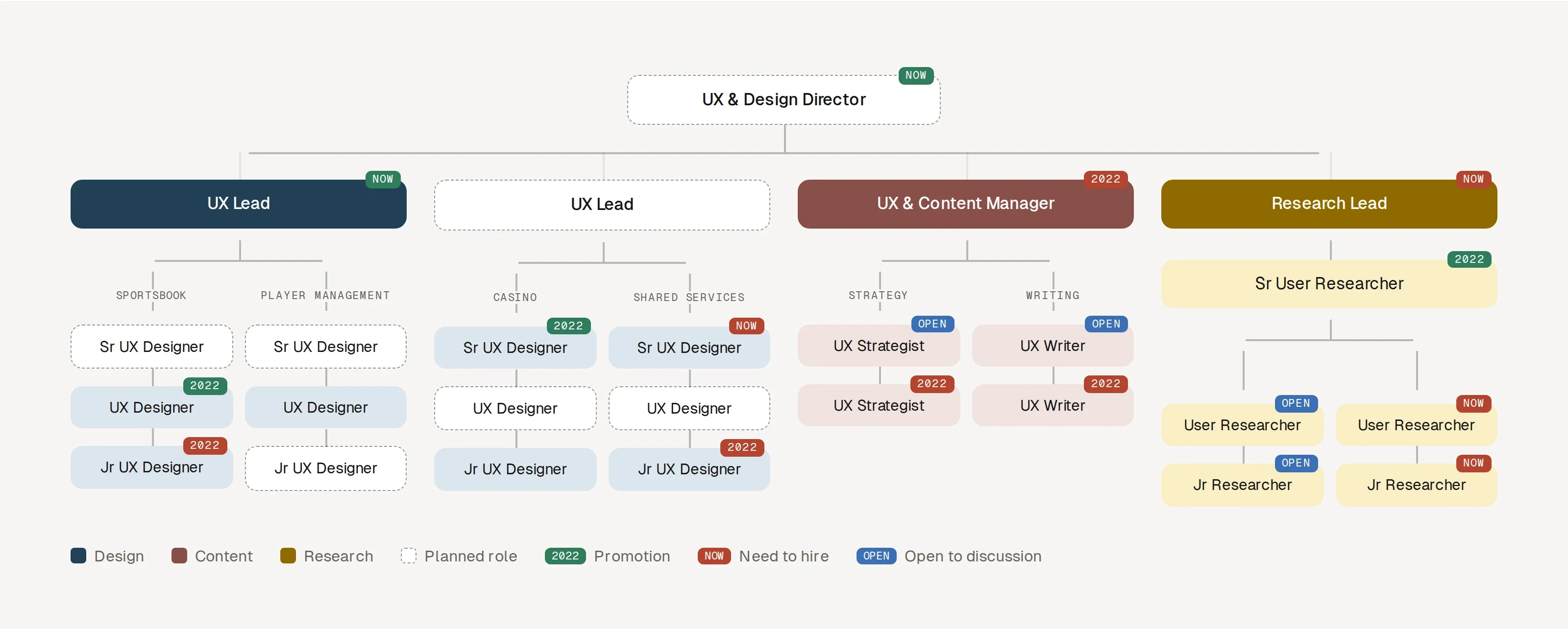
UX org plan: a director over two UX leads, a content manager, and a research lead, with planned roles and timing
Planned org · dashed boxes are roles we planned to add
The team

Pods that matched the business

I organized the team around three disciplines (design, research, and content) and aligned it with Product and Engineering in pods for Sportsbook, Casino, and Shared Services. A senior designer led each pod, with promotion to UX lead as the next step, which gave clear ownership and a path for designers to grow. I hired seven people across design, research, and content; the last, a UX writer, started after I left.

Pod team: PM with designers, researchers, a strategist, a writer, and a BI analyst
Pod team · one pod, every discipline

A design system, once the team was ready

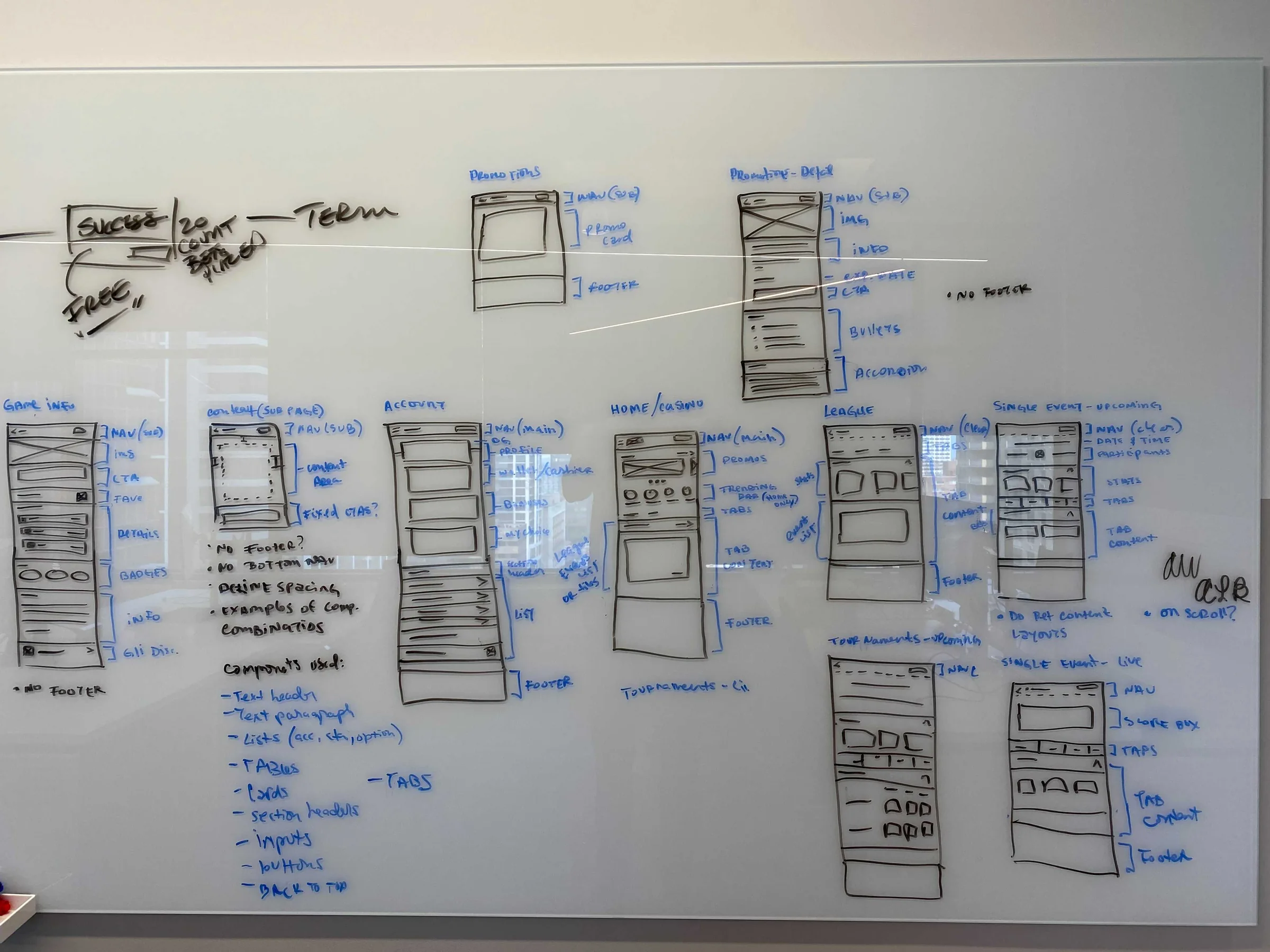
We inherited a large product mid-growth, so shipping came first. Once the team matured, I mapped every page template on the whiteboard to standardize layouts, then ran a UI audit across web and mobile. Both became the starting point for the system: a documentation file for foundations and components. It was still in progress when I left, but work was already more consistent across teams.

Trade-off

Chose: ship the core experience first. Gave up: a system on day one. Why: one built before the product settled would have been rebuilt within months.

Whiteboard sketches standardizing page templates
Whiteboard · page templates, sketched before the design system
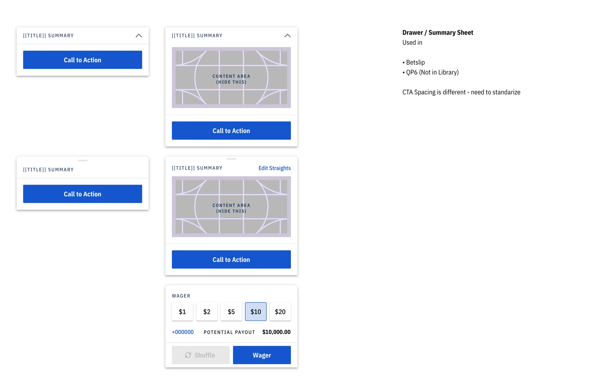
Component audit: drawers
Component audit · drawers and summary sheets
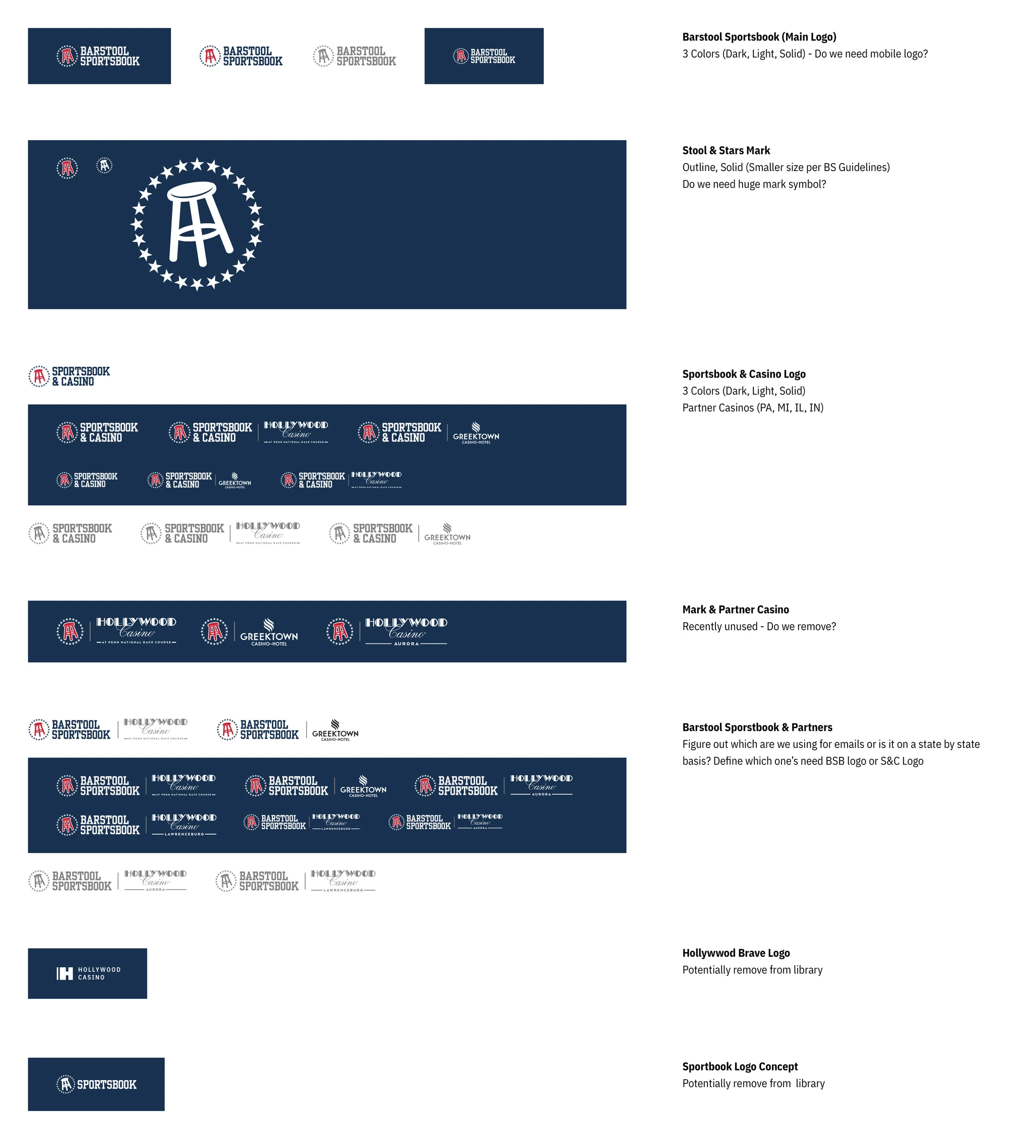
Component audit: logos
Component audit · logos
Outcome

A research-driven UX practice, built in about a year and a half

The app launched to a #1 weekend in the App Store and a 4.8 rating, while the UX team grew from two people to eight, with research, pods, and a design system behind it.

Launch-day video call
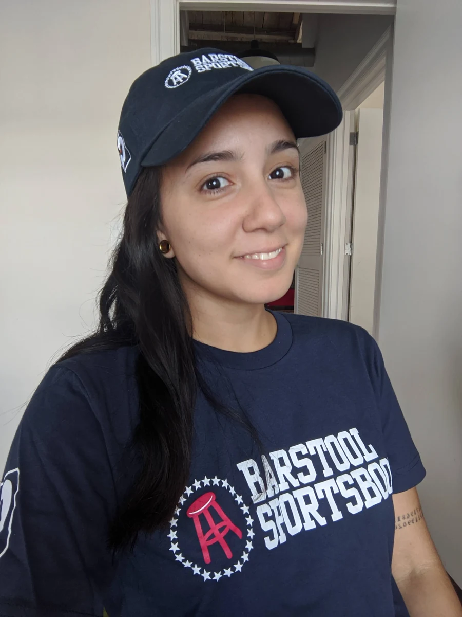
Karen in Barstool gear
2 → 8people across design, research, and content
#1sports app in the App Store on launch weekend
4.8App Store rating a month after launch
Reflection

I didn't know how to build a team when I started, so I approached it like any design problem: I researched, learned from my peers, and adjusted as we went. Being trusted to lead showed me I could do it, and I left wanting to see how much further it could go.

Bringing Oracle's acquired ad-tech tools together

This case study includes confidential product work, so it's password protected.

It's on the résumé I send with applications, or message me on LinkedIn.

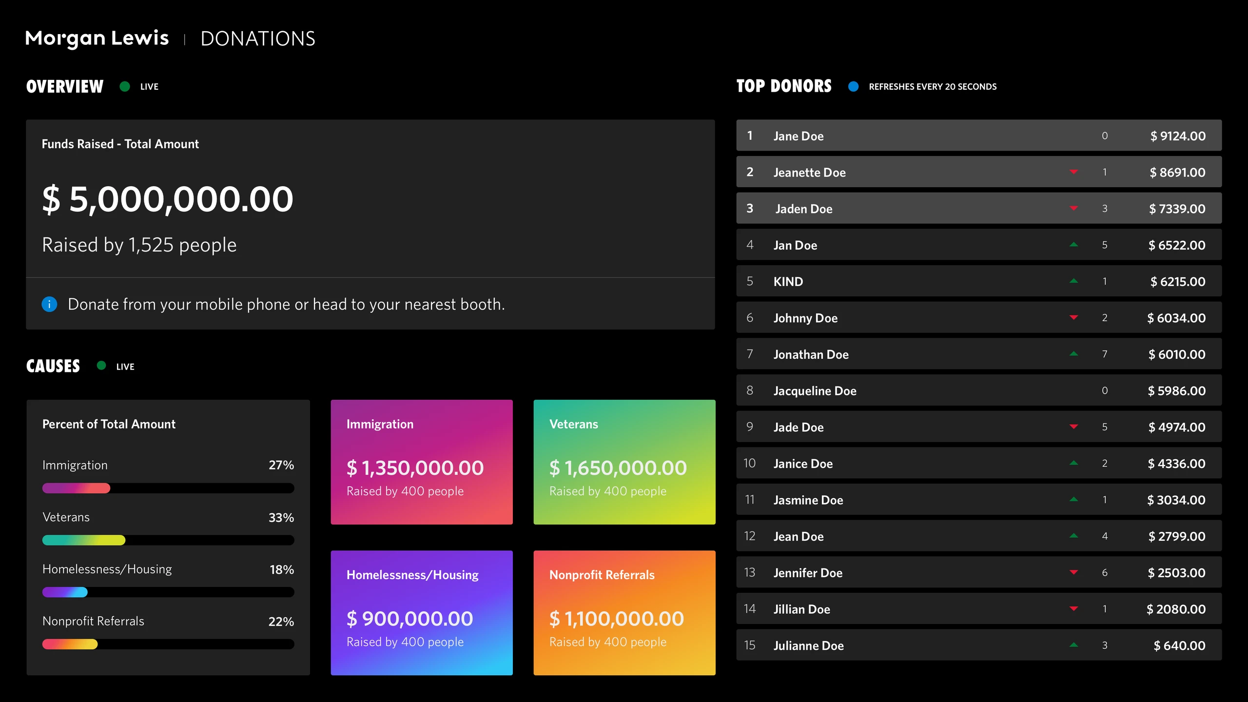
A self-serve system for the firm's week of giving

This case study includes confidential product work, so it's password protected.

It's on the résumé I send with applications, or message me on LinkedIn.

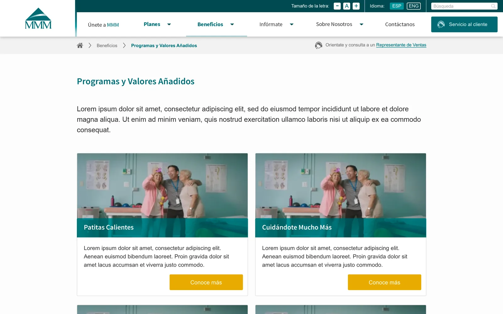
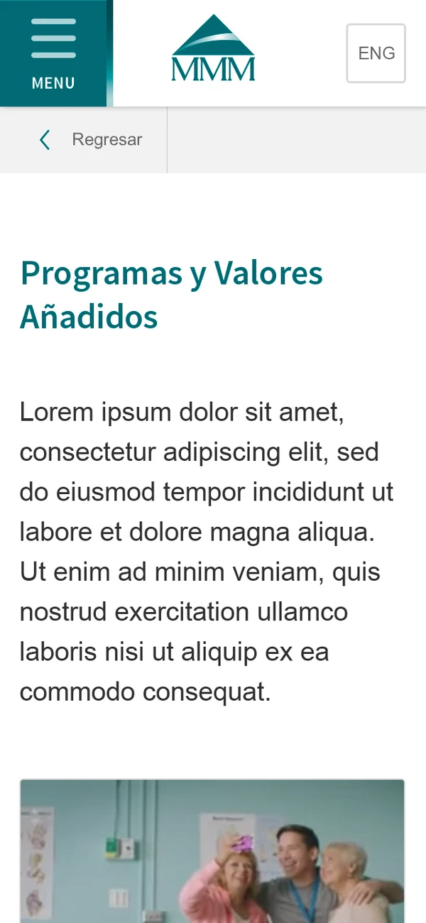
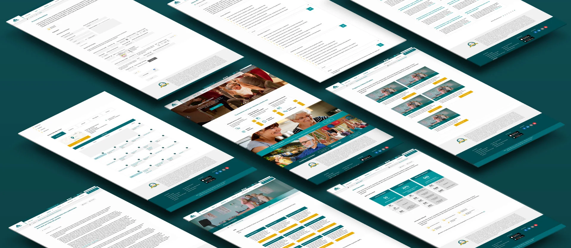
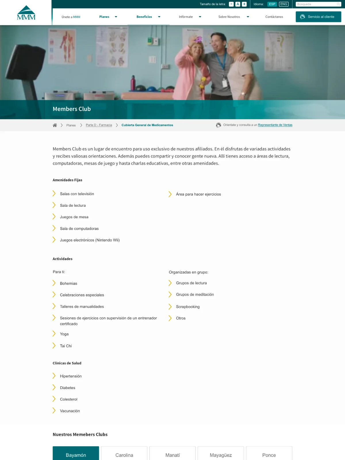
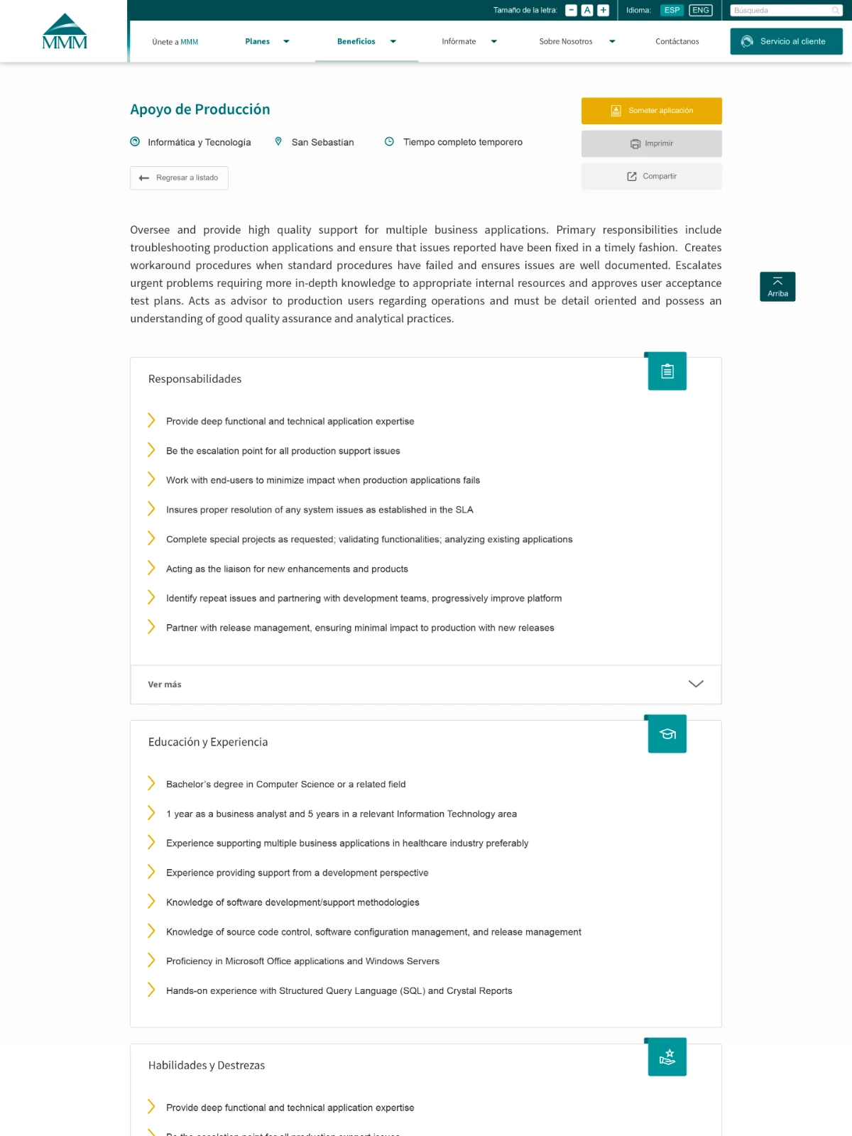
70+ Medicare pages, restructured into a site seniors can use
I audited a Medicare provider's 70+ pages, regrouped them around what seniors and caregivers came to do, and designed accessible templates that held up no matter who wrote the content.

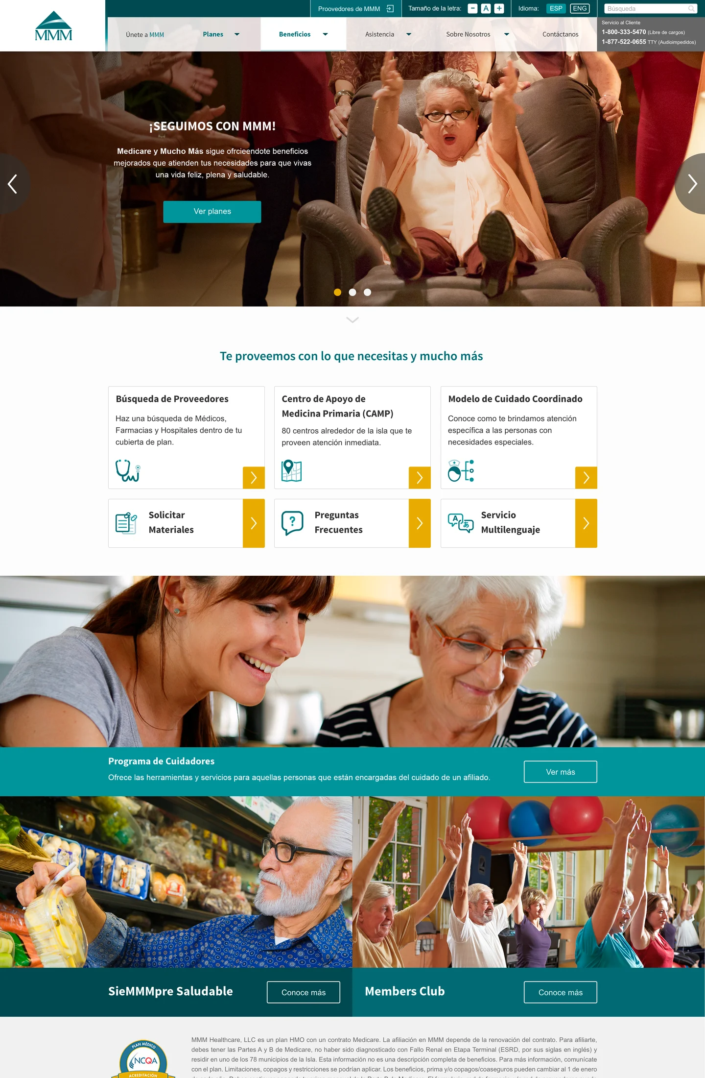
Redesigned MMM home page on desktop
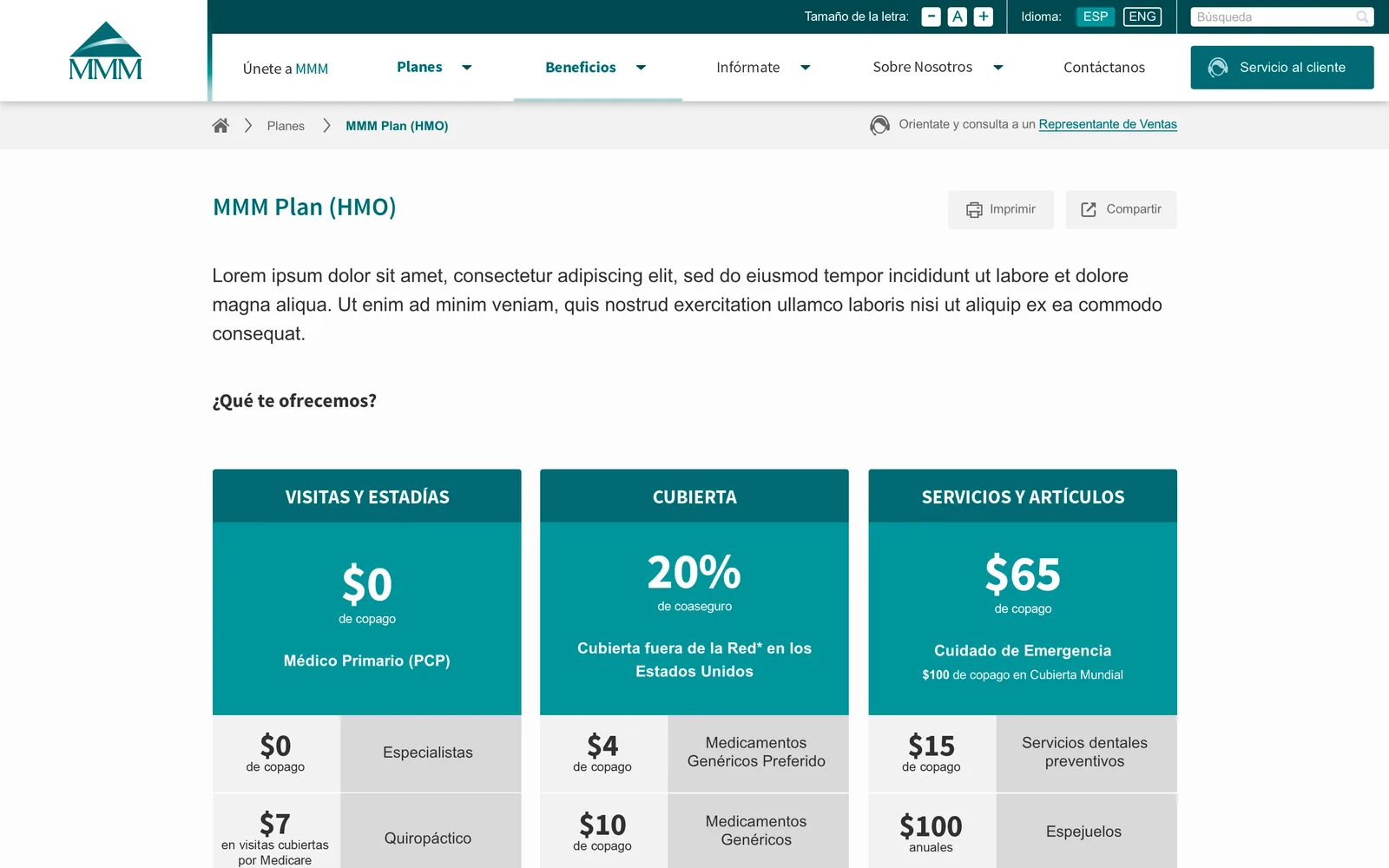
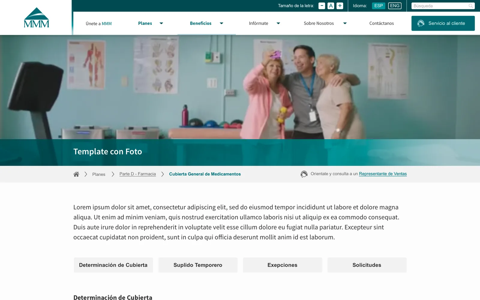
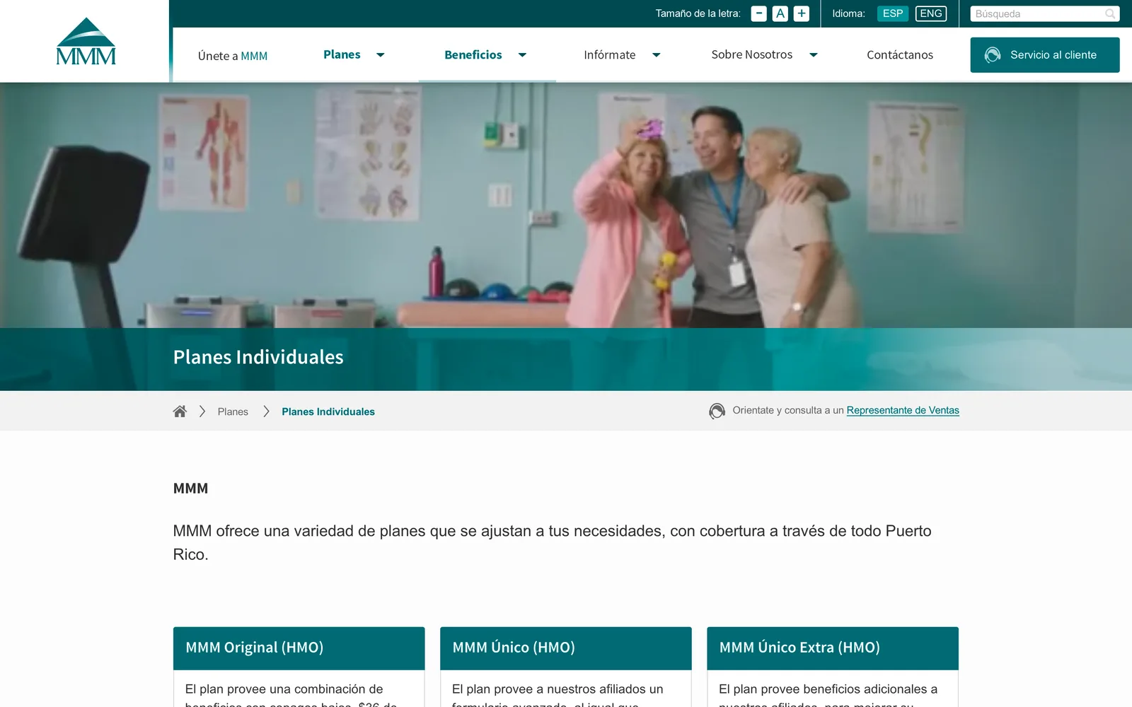
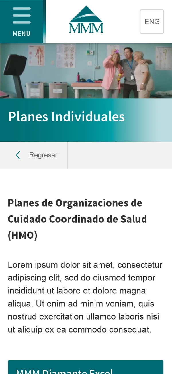
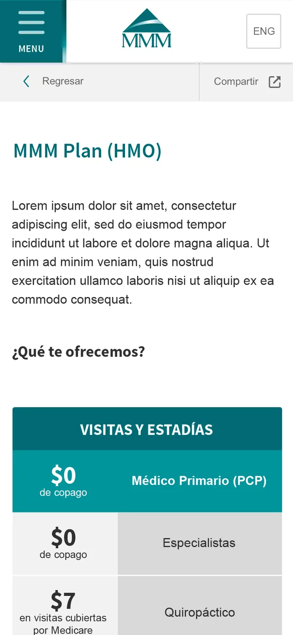
Redesigned MMM plan detail page on desktop
Agency
Young & Rubicam
Role
Art Director
Timeline
2016 · launched Oct
Team
Solo designer, a PM, an engineering vendor

Medicare y Mucho Más (MMM), a Puerto Rican Medicare provider, needed far more than a visual refresh. Over seventy pages had grown into a maze, and the site had to follow Medicare marketing rules and Section 508 accessibility guidelines.

Seniors and caregivers struggled to find information or reach sales and service. The goal was a clear, accessible site: contact paths up front so more people reached sales, answers people could find on their own instead of calling service, and a content structure the client could keep up long term. The site was Spanish first, with English second.

The old MMM site: home page The redesigned MMM home page
Home page · before and after
0103Structure

Regrouped by what people came to do

In discovery, I looked at local competitors and enterprise sites with similar content to see how they laid it out. Then I audited all 70+ pages, some long and some a single paragraph. Looking at redundancy, relevance, and structure, I combined pages and grouped the content into sections that matched what people came to do.

For the business, the homepage and key pages put contact paths up front and sorted messaging into sales, education, and announcements, balancing regulatory transparency with clear calls to action.

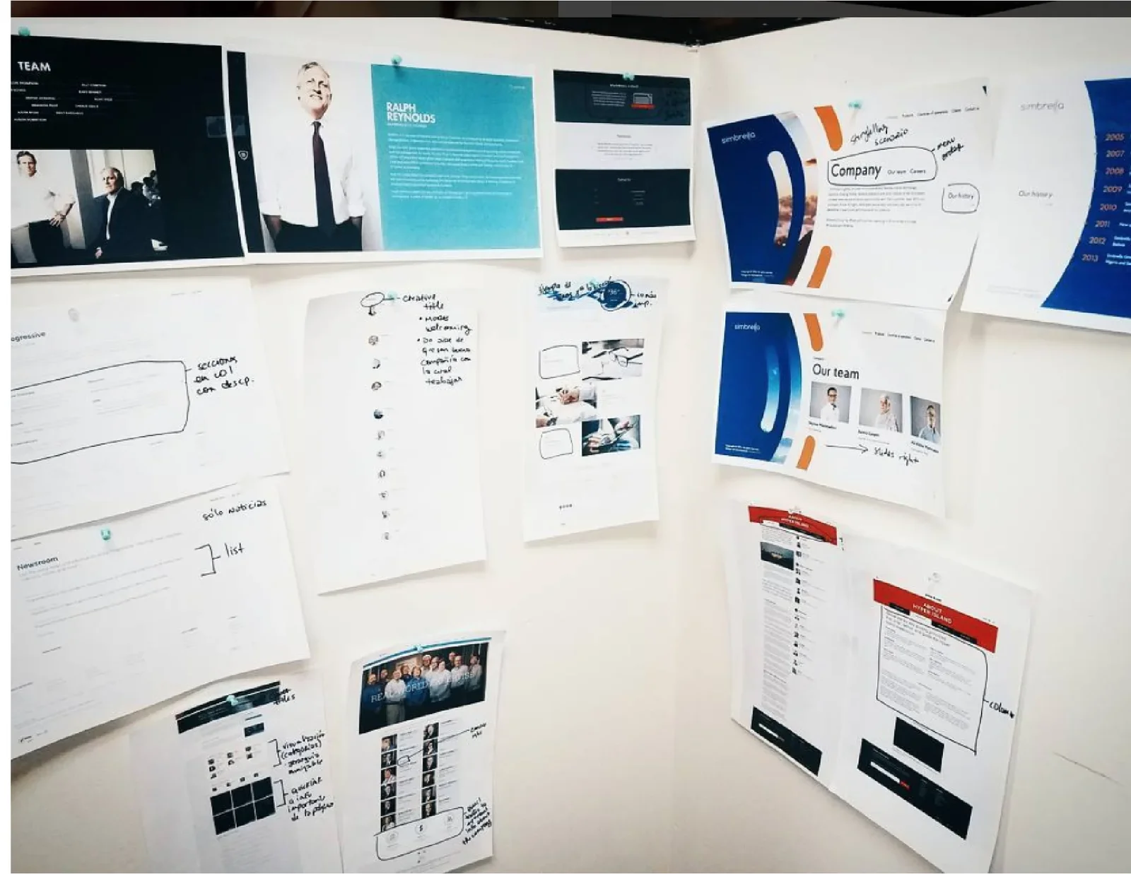
Printed reference sites pinned to a wall, marked up with handwritten notes on layout and content
Discovery · reference sites pinned up and marked up
Revised MMM sitemap, color-coded by template
Revised sitemap, color-coded by template
Templates

Five templates, a handful of one-offs

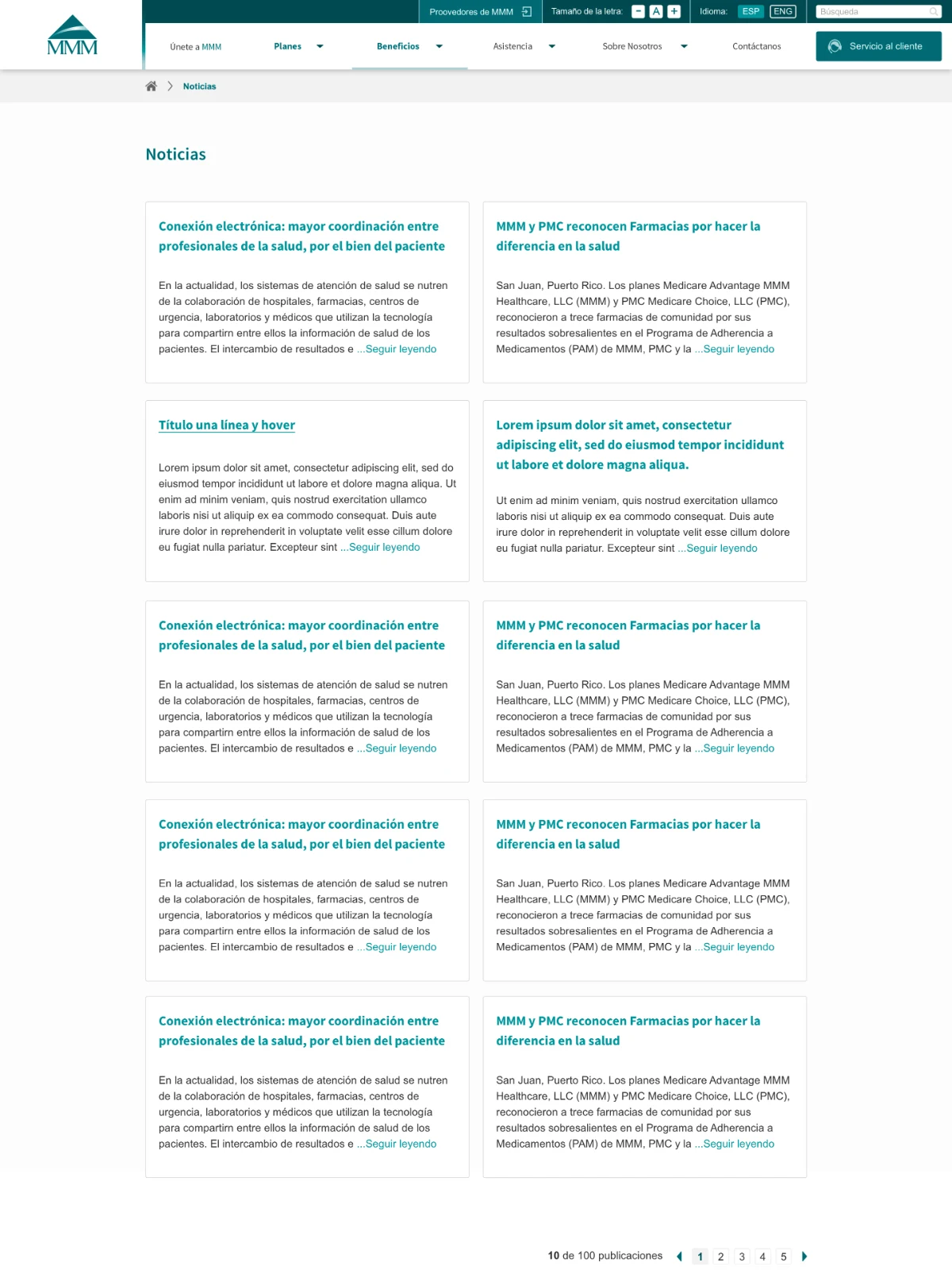
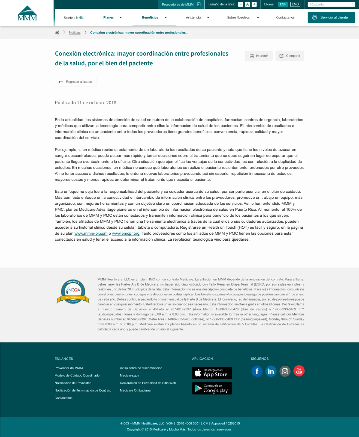
The sitemap became a set of CMS templates: blocks, content with a hero image, content with text only, product list, and product detail. Pages with their own job, like forms, maps, contact, the glossary, and search results, became one-offs. Standard page types meant routine updates no longer needed new design work.

Template system: five templates (blocks, content with hero image, content with text only, product list, product detail) and five one-offs (forms, maps, contact, glossary, results)
Editable modules

Every page, built from the same parts

Inside the content templates, the client's team built pages from editable modules, so pages stayed consistent no matter who made them.

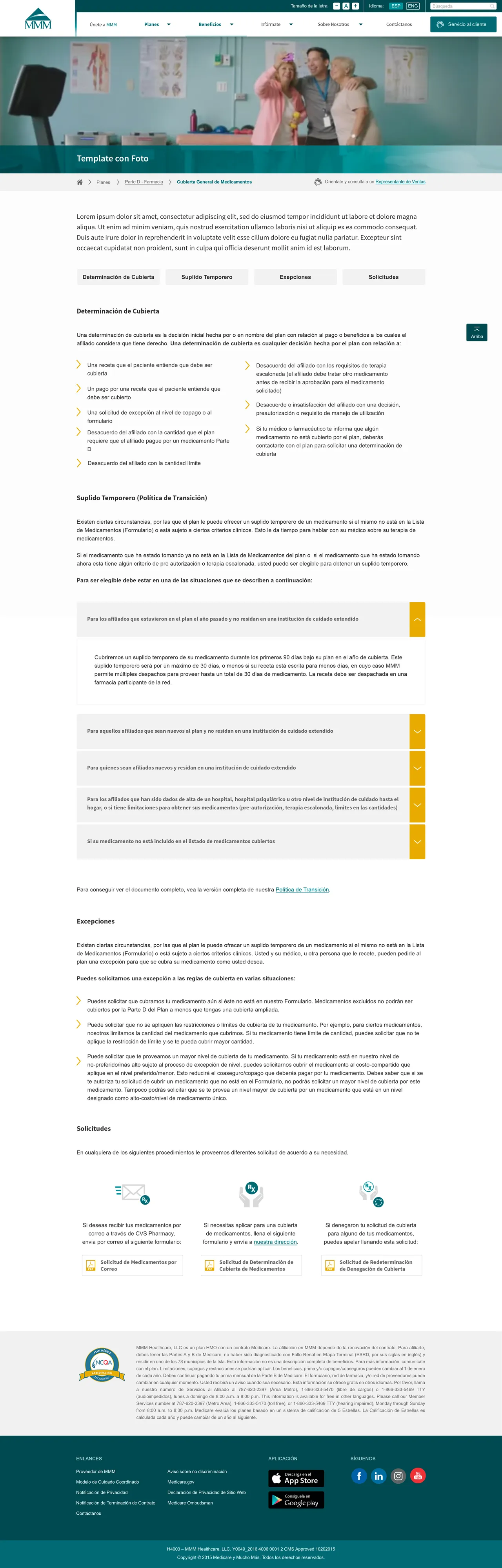
Full content page template showing every editable module
  1. 01Hero image
  2. 02Anchor buttons, back-to-top, 2-column bullet list
  3. 03Accordions
  4. 041-column bullet list
  5. 05Responsive 3-column row: icon, text, and button variables
0203Design
Handoff

Every behavior, written down

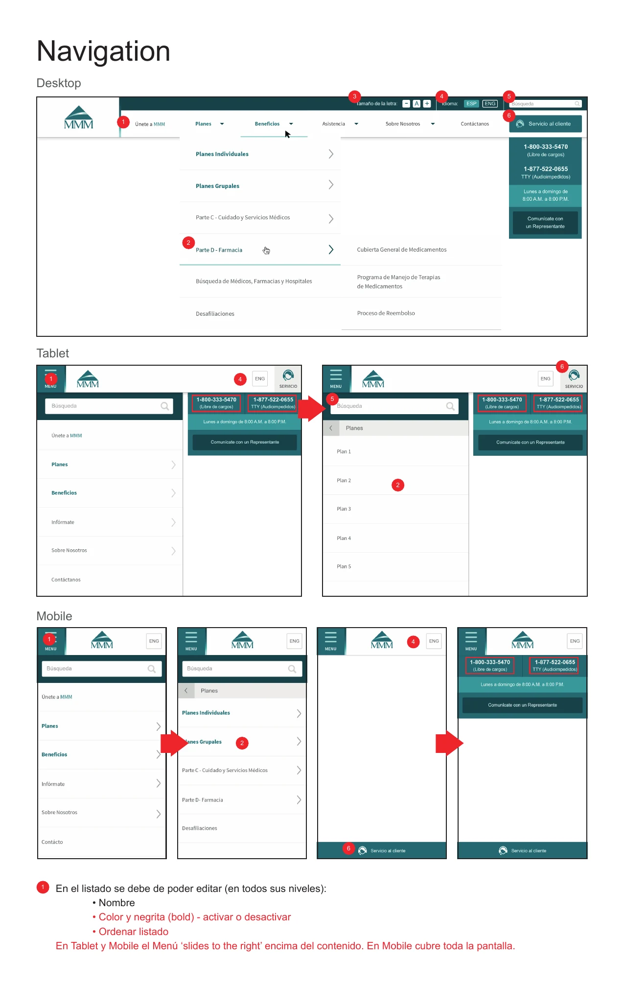
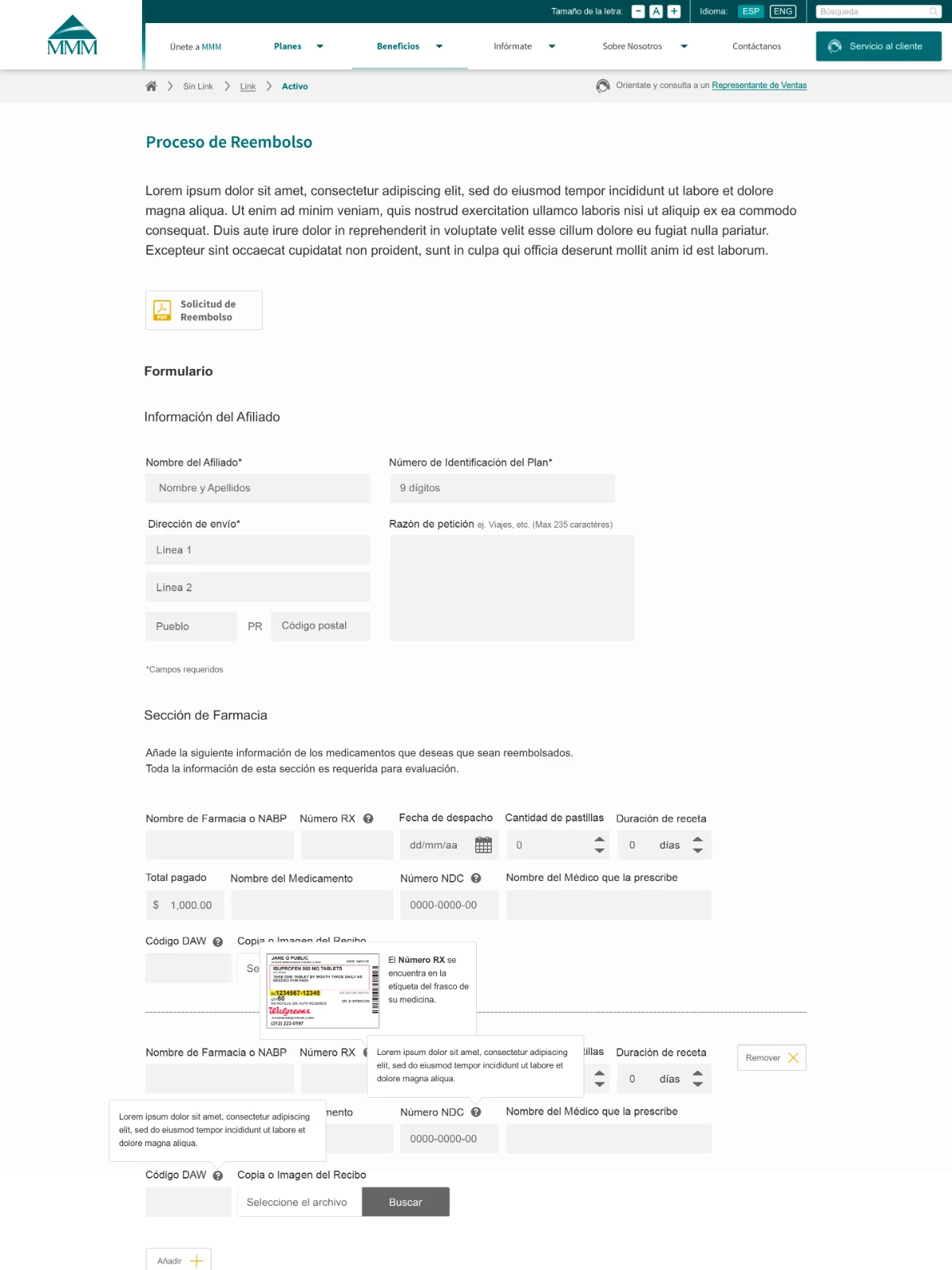
Before the build, I annotated every template for the engineering vendor, page by page and breakpoint by breakpoint: what the client could edit in the CMS, and how each element behaved.

Many of the notes were about the audience. Text grows up to three sizes from a 16px default. Phone numbers became click-to-call on tablet and phone, where a service tab stayed pinned to the bottom of the screen. Numeric form fields opened the number keypad, and search still found "página" when someone typed "pagina."

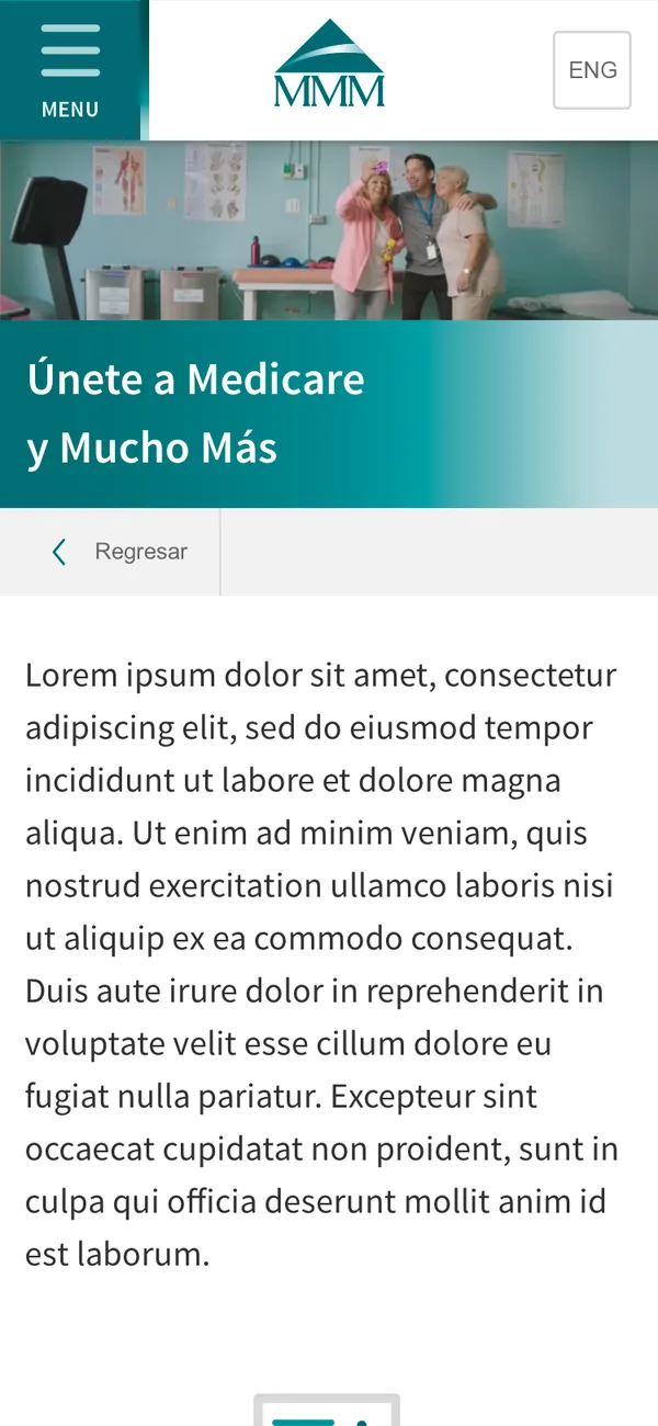
Annotated navigation spec showing the menu, text size controls, language toggle, search, and customer service tab on desktop, tablet, and mobile
Navigation spec · desktop, tablet, and mobile · Aug. 2016
0303Release

Sharp betting, made simple for everyday bettors

This case study includes confidential product work, so it's password protected.

It's on the résumé I send with applications, or message me on LinkedIn.

Paperless billing, designed inside a brand-new design system
On a three-month contract, I designed Comcast Business account screens on a design system that was still rolling out, and cut steps out of EcoBill sign-up along the way.

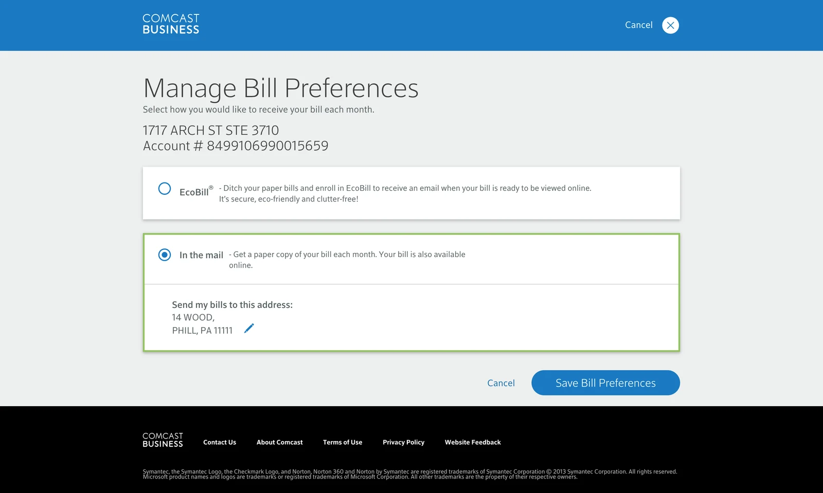
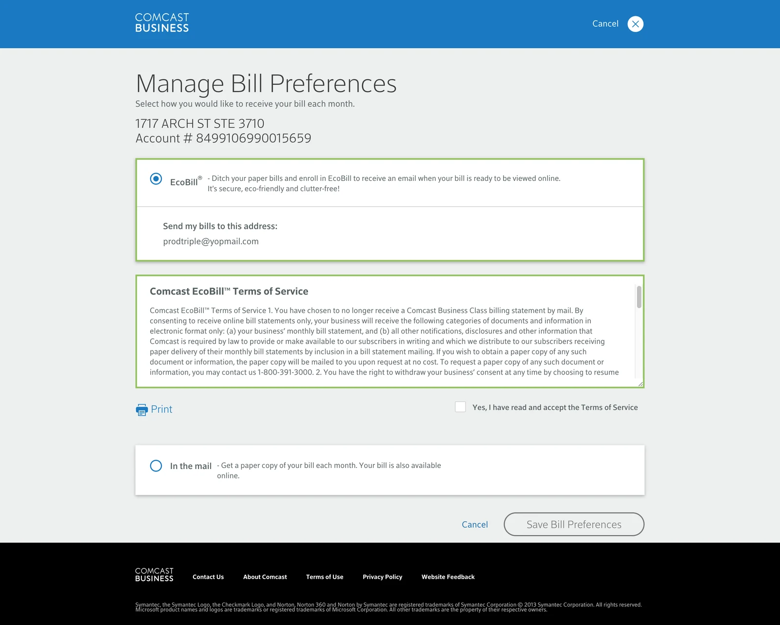
Before: the old Manage Bill Preferences page
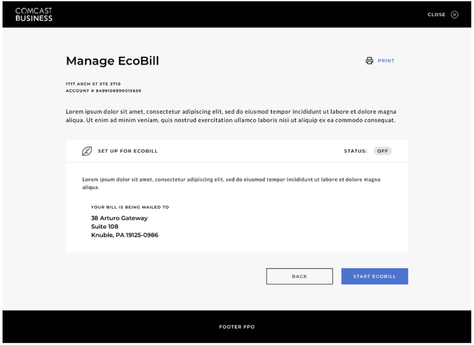
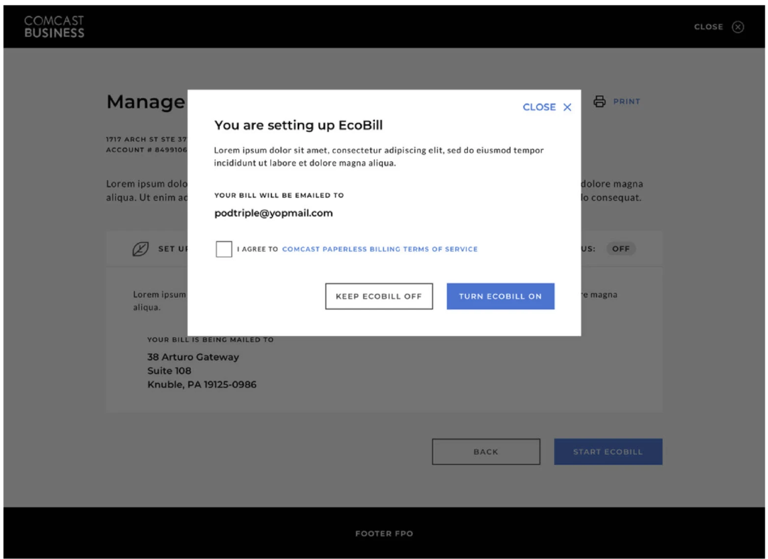
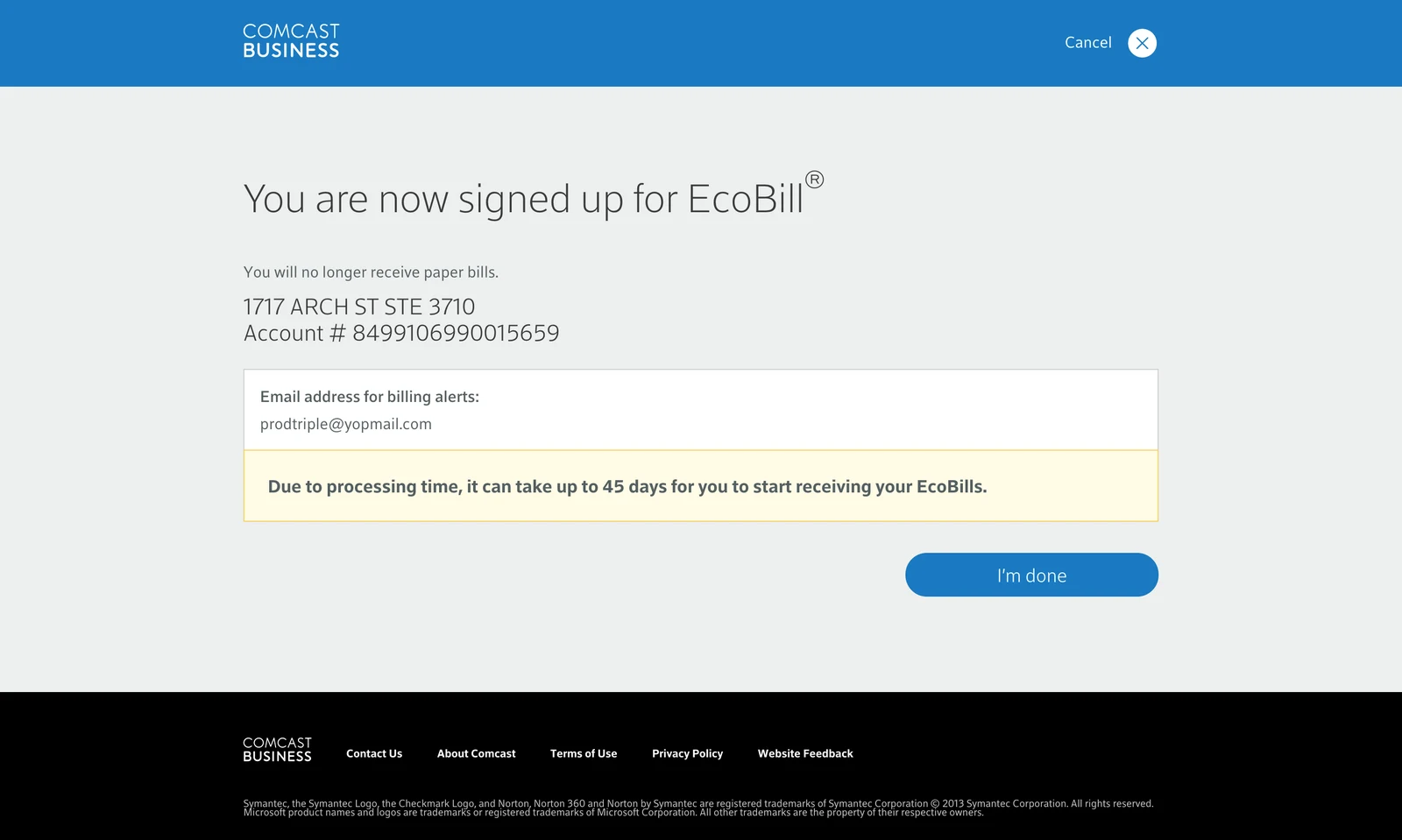
After: the redesigned Manage EcoBill page
Agency
SapientRazorfish
Role
Senior UI Designer
Timeline
3 months, 2018
Status
Shipped to customers

I partnered with a UX designer to bring Comcast Business's new design system into account screens that were already in flight. The UX designer owned the flows; I owned the screens, applying the system's components, type, and icons while honoring its intent.

I designed several areas of the account. EcoBill, Comcast's paperless billing, is the sample I still have. I sat in every scrum ceremony so layouts held up in the build, and the work shipped to Comcast Business customers.
Design system by Jason Bishop ↗
Comcast Business bill payment screen on the new design system
Bill payment on the new system
0101Design

Fewer detours on the way to paperless

Each screen kept the approved UX intent and moved onto the new system's components, type, and icons. In the screen design, I also took out two detours.

Terms in a modal. The old page dropped a scrolling wall of terms into the form. I replaced it with a short modal that asked for one checkbox.

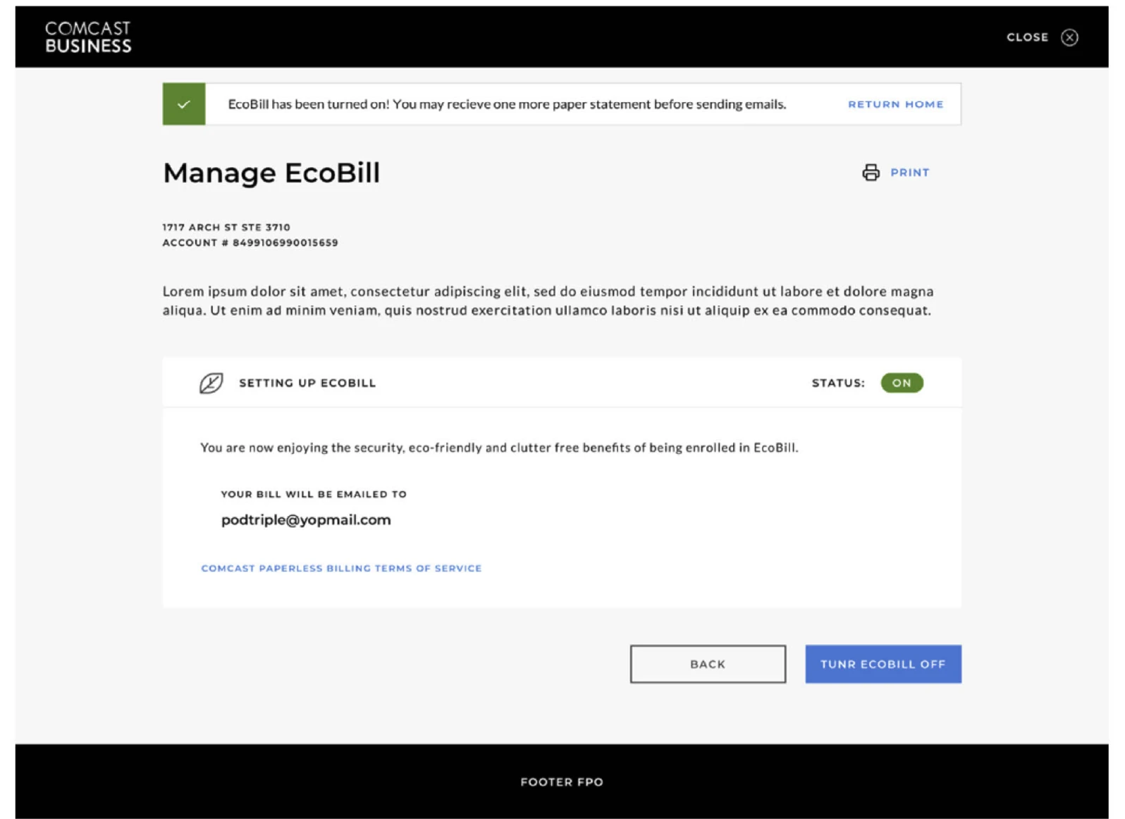
Confirmation in place. The old flow ended on a separate page. I replaced it with a banner that confirmed sign-up on the same screen, and the EcoBill status switched to ON.

Old Manage Bill Preferences pageRedesigned Manage EcoBill page
Manage EcoBillBeforeAfter
Old EcoBill setup with the full terms of service inside the pageRedesigned EcoBill setup: a modal with one terms checkbox
EcoBill setupBeforeAfter
Old separate EcoBill confirmation pageRedesigned confirmation: an inline banner and EcoBill status ON
ConfirmationBeforeAfter

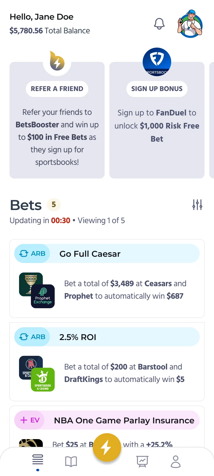
A name and logo for quick bets

I created name and logo concepts for a sportsbook's live-betting feature. The client launched it as HyperLive.

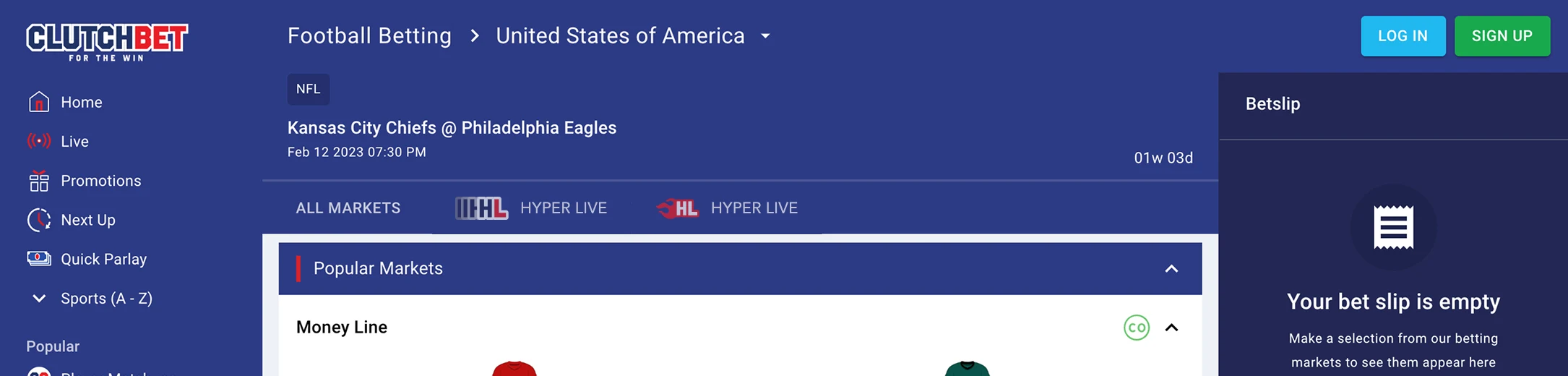
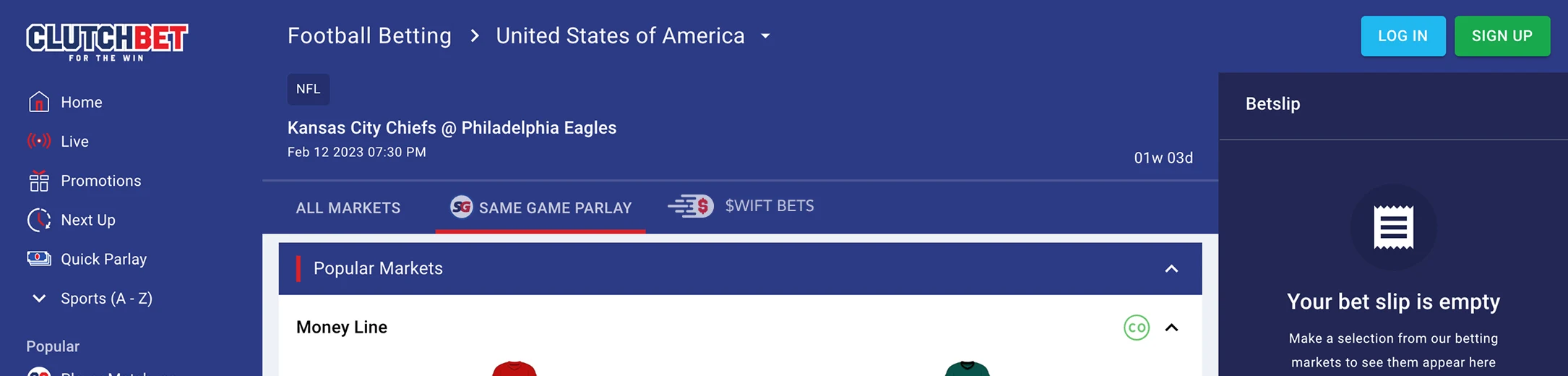
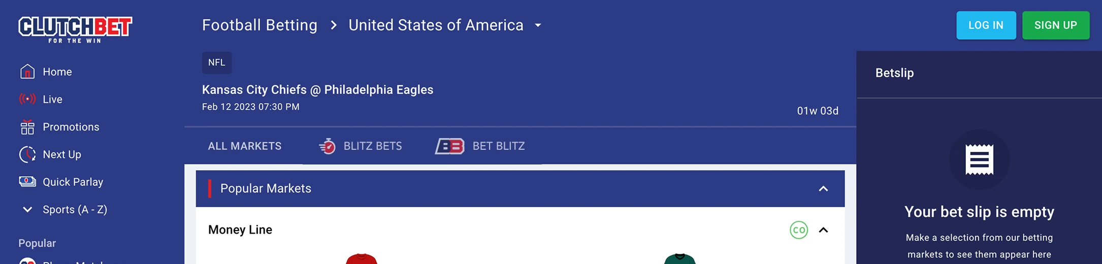
Three name and logo options for Clutch Bet's live-betting tab, each shown in the product
Client
BlueBet
Role
Freelance Designer
Timeline
2023
Deliverables
Names, marks, UI mockups

BlueBet, the company behind the Clutch Bet sportsbook, was adding a live-betting feature for fast, in-game bets. It needed a name and identity: a marketing name for the promo carousel, and a short logotype for a dedicated in-app tab.

Working from the existing style guide and earlier feature references, I explored three directions, each meant to say speed, urgency, and immediacy while staying inside the sportsbook's visual language.

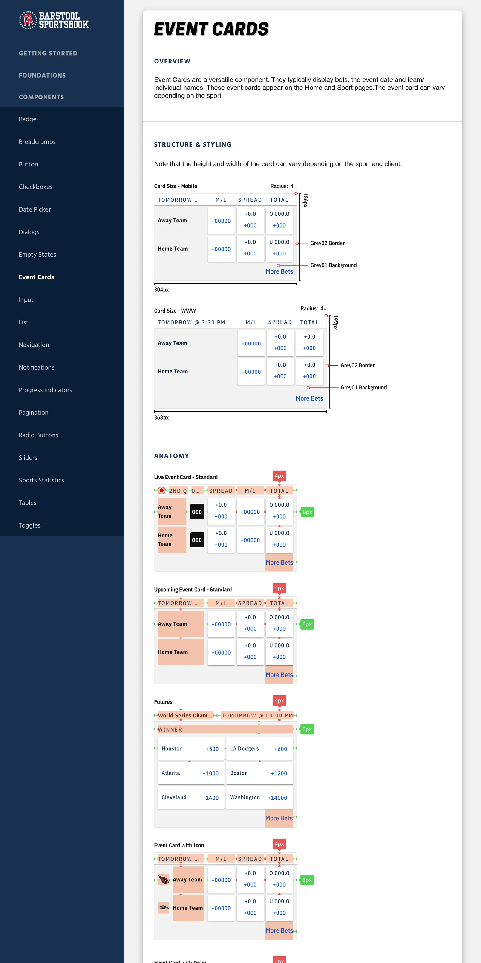
Clutch Bet style guide: type, colors, navigation, and promo examples
Starting point: the style guide
0101Options
Three directions

Three names, tested in the real interface

Each option came with a wordmark, a short mark, and an icon. I placed every one in the sportsbook's live markets tab to check clarity, hierarchy, and legibility at small sizes.

I handed off a Figma file the team could export from or duplicate. I recommended two names, HyperLive and $wift Bets, and the logo marks over the circle icons because they read as more branded. The client went with HyperLive, a feed of quick in-play bets on NBA, MLB, and NFL games. They announced it for a May 2023 launch in Colorado and Iowa and credited me for the creative assets.

Source: Clutch Bet launch announcement, LinkedIn ↗

HyperLive wordmark with speed barsHyperLive wordmark with flame
HyperLive shown in the Clutch Bet live markets tab
Option 1 · ChosenHyperLiveTwo treatments: speed bars or a flame.
$wift Bets wordmark
$wift Bets shown in the Clutch Bet live markets tab
Option 2 · Recommended$wift BetsThe dollar sign does the talking.
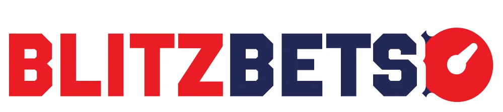
Blitz Bets wordmark with stopwatch
Blitz Bets shown in the Clutch Bet live markets tab
Option 3Blitz BetsA stopwatch for in-game timing.

A local campaign for a global brand

I designed a campaign page and photographed the products for a site celebrating Pfizer's Puerto Rican workforce.

Agency
KIS Digital
Role
Visual Designer
Timeline
2015–16
Deliverables
Landing page, product photography

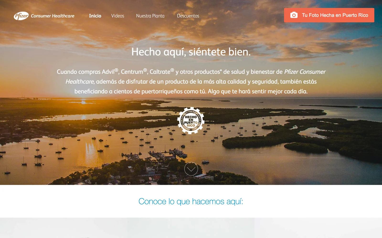
I designed and art directed a campaign landing page celebrating Pfizer's Puerto Rican manufacturing workforce and its partnership with the "Hecho en Puerto Rico" initiative.

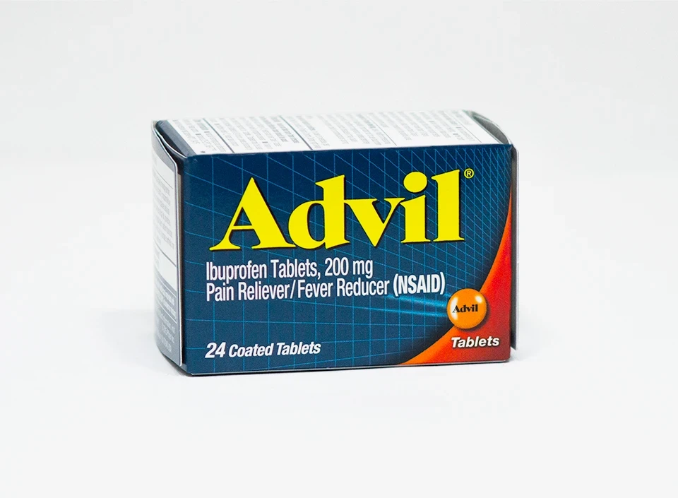
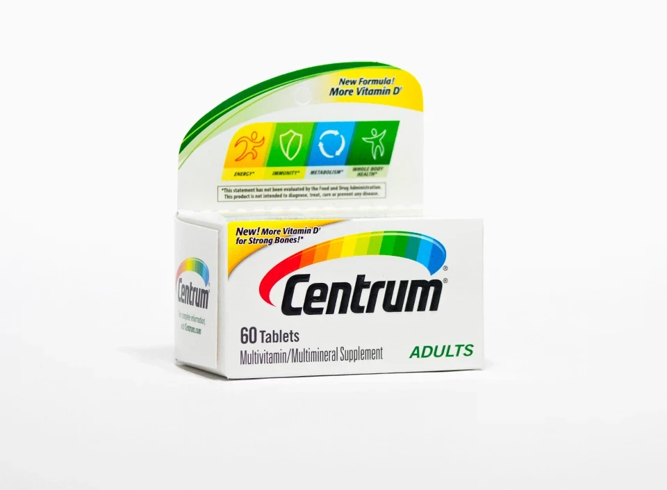
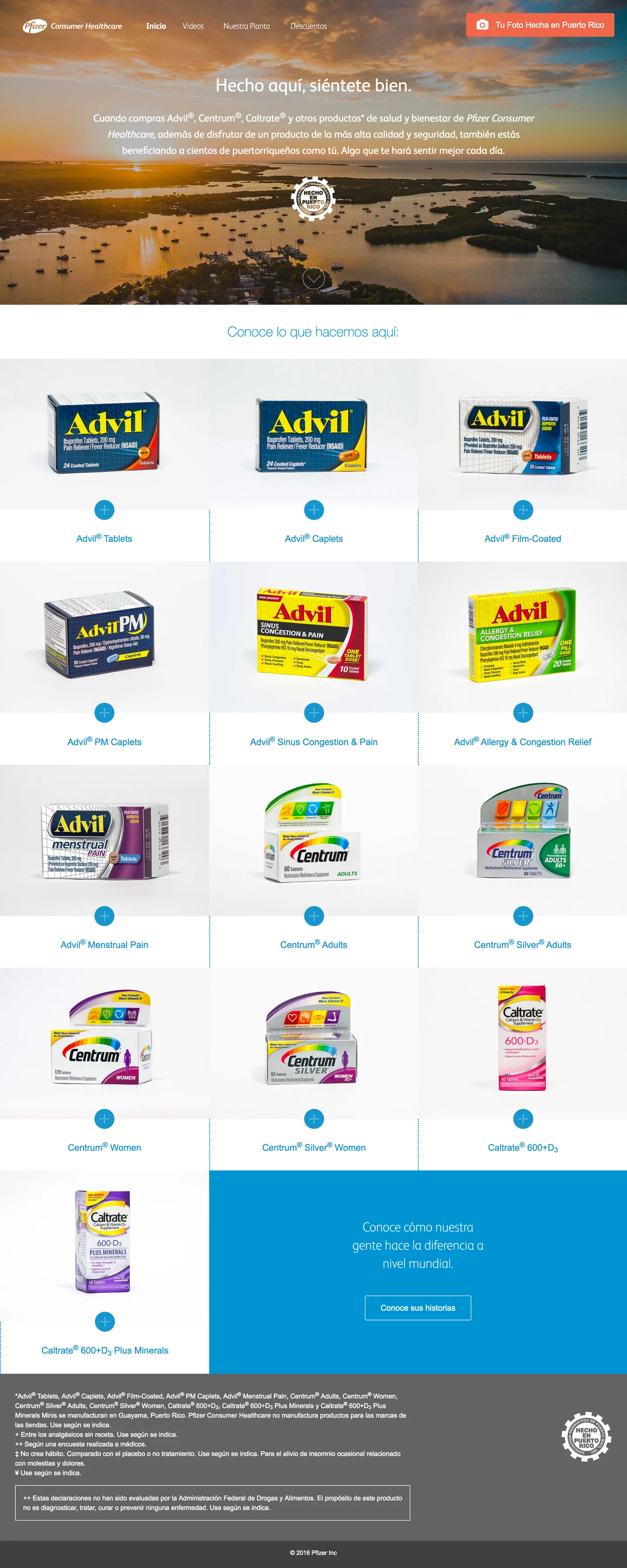
The page showcased a wide range of locally made products in a portfolio-style layout that kept the focus clear. I led the interface design and the original product photography, with clean studio shots that made each product feel real.

The site launched as sientetebienpr.com under our agency's campaign line, "Hecho aquí, siéntete bien," and was live by April 2016. It kept growing after launch, and I designed those additions too: videos with the plant's people and their stories, a discounts page, and "Tu Foto Hecha en Puerto Rico."

Source: sientetebienpr.com, Wayback Machine, April 2016 ↗

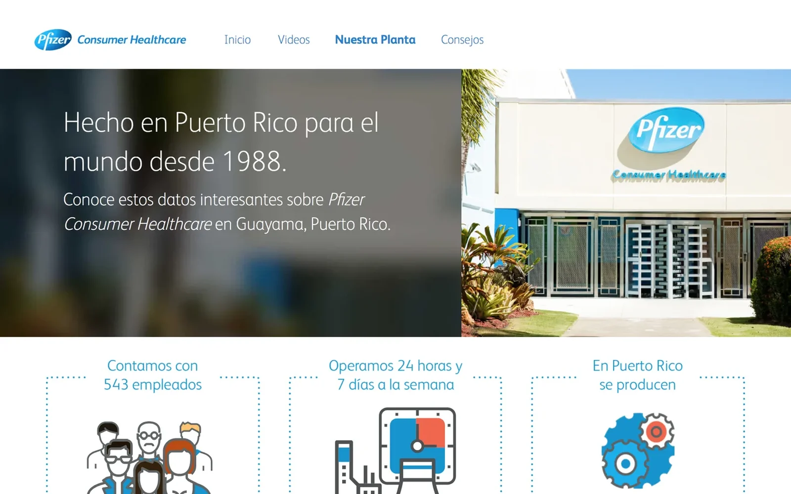
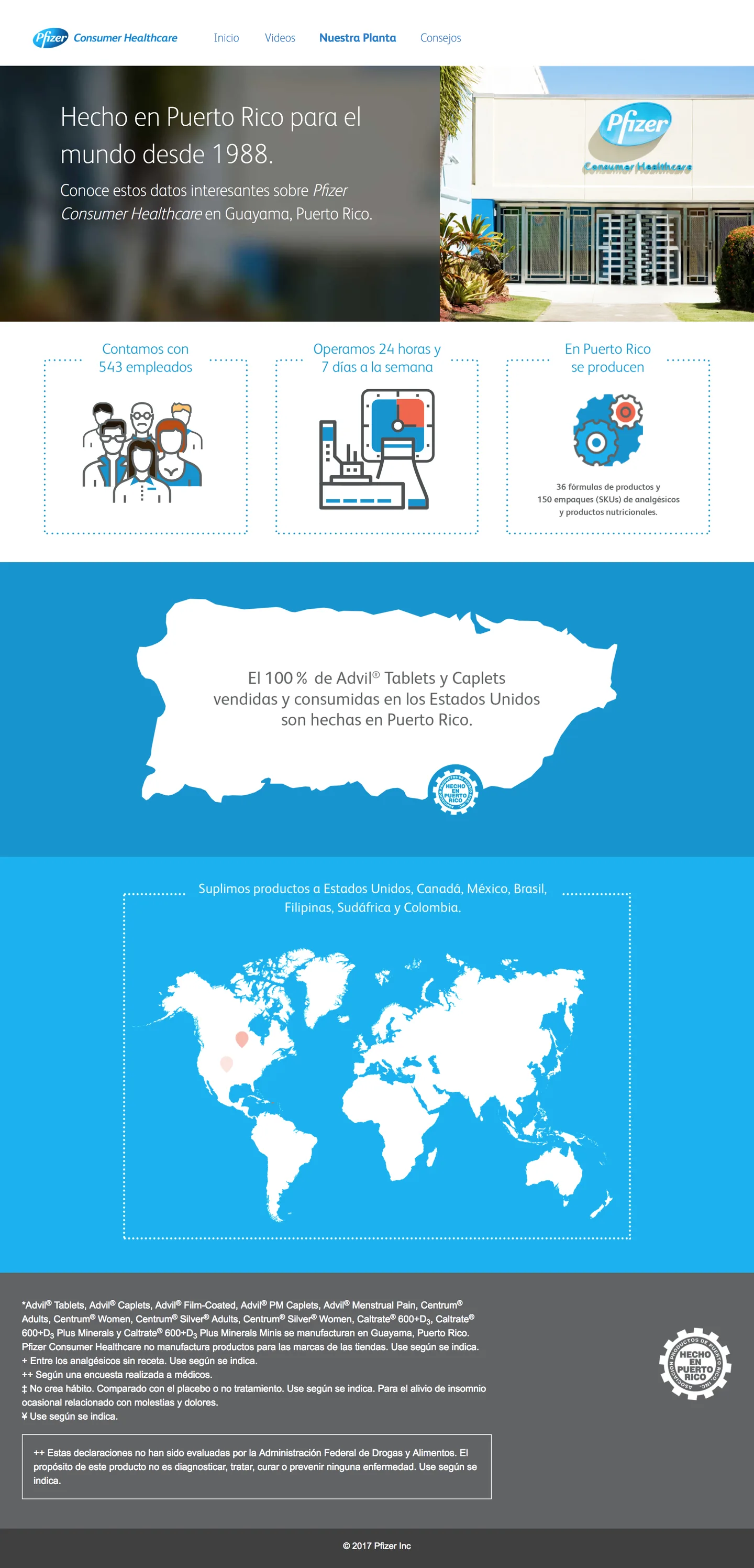
Facts page: made in Puerto Rico for the world since 1988
The facts page
0102Photography

From brand renders to studio shots

Instead of using the standard brand renders, I photographed the products in-house: white background, minimal shadow, a museum-like look that let each box stand on its own in the gallery.

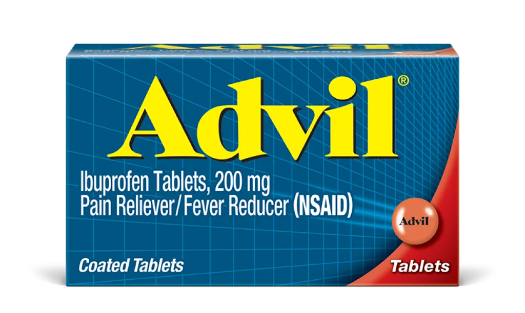
Standard Advil brand asset
Brand asset example
Advil coated tablets Advil caplets Advil film-coated Advil Allergy & Congestion Relief Advil Sinus Congestion & Pain Advil PM Centrum Adults Centrum Women Centrum Silver Women 50+ Centrum Silver Adults 50+ Caltrate 600+D3 Caltrate 600+D3 Plus Minerals
0202Design

A gallery for the products, a page for the plant

The landing page opened over the Puerto Rican coast and laid the locally made products out like a gallery, each one with its own studio shot. The facts page told the plant's story: made in Puerto Rico since 1988, 543 employees, running 24/7, every Advil tablet and caplet sold in the US, and products shipped from there to markets around the world, with the numbers and the map animating in as visitors scrolled.

Full landing page: hero, product gallery, call to action, and footer
Landing page
Facts page: employees, 24/7 operation, Advil made in Puerto Rico, and the distribution map
Facts page